Via Padova
Via Padova
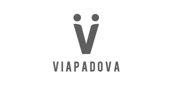


- Once upon a time, the area known as Via Padova in Milan, Italy, had a less than salubrious reputation. Our project was to help change that image by creating a new identity for the area that would bring the various groups of people – or local tribes as we called them – together. We needed to represent Via Padova as a space that welcomed every one of its citizens – a challenging proposition. The city needed a visual system, a graphic identity that could organise and simplify communication with the people.
We used the letter V to symbolise a handshake – and hence the union and coming together – of two people, symbolising a community coming together.
 Designer: studionugno
 - Submitted: 08/08/2016 • Featured: 08/08/2016
- Stats: This logo design has 3726 views and is 3 times added to someone's favorites. It has 5 votes with an average of 3.00 out of 5.
Designer


