

LogoMoose Logo Inspiration
  • Logo
    Galleries
    • Featured logos
    • Most rated logos
    • Most viewed logos
  • Identity
    Galleries
    • Featured identities
  • Packaging
    Galleries
    • Featured Packaging
  • Designers
  • Upload
  • Become Member
  • Login

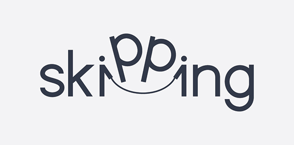
Skipping

  Skipping  

Skipping
Facebook
fb-share-icon
Pinterest
Reddit
  • Skipping verbicon Designer: Samadara Ginige
  • Submitted: 10/31/2017  •   Featured: 12/14/2017
  • Stats: This logo design has 12863 views and is 0 times added to someone's favorites. It has 35 votes with an average of 4.51 out of 5.
  • icon
  • Samadara Ginige
  • simple
  • skip
  • skipping
  • verb
  • verbicon
  • Word
  • wordmark

  Designer  

Samadara Ginige

View portfolio

  More logo design  

Eggis

Children's shops

yoonComments0Mar-21-16
Portofinio Trading Limited

Portofinio Trading Limited is a company who sell promotional materials, and also provide technology equipment to businesses.

After careful thought, in its most basic form the Portofino Trading Ltd product offering (be it promotional items or technology) helps business build connections to grow and succeed. The icon here has been designed to represent the idea of being ‘continuously connected’, growing, adapting and developing. Follow the line in either direction, and at its core you are taken back out towards a different location. Interlocking like a chain that never ends. Also looking like a propeller to represent the clients success with the support and guidance from Portofino Trading Ltd.

This icon also represents the companies ability to build relationships, and quickly adapt and see trends.

Overall the design is confident, timeless, and gives the impression of an established and trustworthy business.

View more information here: http://logogeek.co.uk/?portfolio=portofino-trading-limited

logogeekComments0Apr-19-14
Sunbreak Homes, LLC

Sunbreak Homes, LLC is real estate company. They buy homes that need work, fix them up to make them beautiful, then list them for sale. The name of Sunbreak Homes was chosen for a special reason. They are based in Seattle, WA, where it rains all the time. So, when the sun does decide to come out from behind the clouds, everybody gets excited. It's called a "sunbreak". The imagery I had in mind for the logo is to somehow incorporate the sun's rays breaking through the clouds, keeping it simple and memorable.

milovanovicComments3Feb-04-15
Vijay travels

Travels Company

magnetikmindComments0Dec-20-14

  About  

Logo Inspiration showcases logos, identities and packaging
We are an inspiration and design community that was founded in 2008.
Here, we showcase logos, brand identities and packaging designs created by professional designers, design studios and agencies. We showcase the best work from the best designers from
Join us and upload your work! Register here!

© 2008 - 2026 LogoMoose.com - All logos are property of their respective owners.
FAQ - Privacy Policy - Imprint