Featured logos
Featured logos – Page 298

Firebrand is a Christian church.


Assembling of excavators

Huge Movie Box. High quality. Huge Collection

logo for a female apparel online store.. a custom type arrangement..

Logo for spin-out company dedicated to the professional preparation of EU projects. Logo symbolizes letter F and man raising hand.
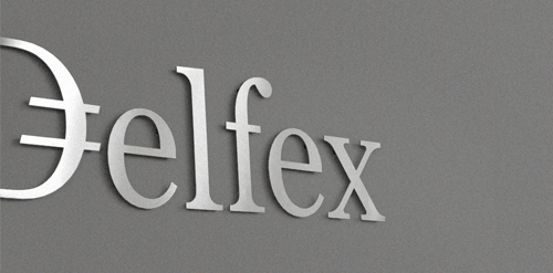
Logo and corporate identity for company trading with foreign currency. I was working on this project last two month. I made for client whole identity set from logo design, stationery design, web design with programming part, copy-writing including slogan and finally design manual. Logo on this photo is mounted in headquarters office on a wall. It was carved out of brushed aluminum plate to gain metallic look which is symbolic interpretation of currency, money and prosperity. Metallic effect literally connects whole identity. All stationery is printed by PANTONE 811 C metallic silver color. For selected materials such as business cards, compliment cards, envelopes and documents folder was used special silver metallic paper.

Ice cream & other

Library logo that represents a bookseller.

Logo for a business coaching and personnel development company in Austria.

my logo compny

Logo for an exclusive event management company which specializing in corporate events.

Kingdom Puzzles - Identidade

Fitness center

Logo for the company producing the paper in various formats, colors and textures.

Designed for PSekiMG, Graphic Designer in Brazil in 2011

Producer of orchard equipment since 1994. "Krolik" means "rabbit".

Mining Industry

KOOL DOWNLOADS

Unused concept for client. I used the negative space to make the cross between both dogs. And I made a custom font for the text.

Italian restaurant.
I started a small graphic tshirt and poster print company. Launching this September...hopefully.

Catering for feinschmeckers

Kegco sells equipment for dispensing draft beer.
Logo and type design for music label owned by Dutch singer Ilse DeLange.