Featured logos
Featured logos – Page 264

store of the premium roses & other flowers


nail-bar

Pediatric dentistry in Moscow. Russian name is "Мартинка".
Simple royal logo with KingFox for almost any business.
Open-air music festival
A sail boat on the top of a sea wave with a sky and fish that are shaking with it .
The M turned with a billow into B by motion.
Logo for Polish political forum. The project idea is the possibility of expression different political views in a reasonable and substantive way. Used proposition / 2012

Logo I've designed for local textile print workshop focused on printing music, games, movies, web and pop culture oriented merchandise.

A small Catering company with 40 years cooking experience needed a logo and website that expressed the professional yet friendly feel.
logo i use to represent myself all over the web. hope you like it.

Travel agency
I designed this logo for the VSO while working at Valdosta State University
An "Alpha" letter which contains a storm inside ,to represent the company name (Alpha Storms)

Frozen yogurt shop in Macau. At first, we had tried to go with something more gentle, smooth and subtle (to match yogurt`s creamy texture), but it turned out that the client prefers a heavier, less refined approach.
This is a design based on client`s own sketch.

Elite High School

Web-shop for girls

Lettering practice

For a iPhone app development company
Chamelion- HD Experiments
Pure Sounds - logo for a website about classical music

Logotype for photographer freelance

sign is designed for scientific and practical journal "Current Research"
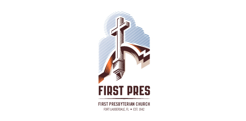
Redesign of the church's old logo in a stylized, illustrative manner, making it more welcoming, contemporary, friendly, casual, & upbeat. Client specified a rendering of the church’s architectural arch and cross in the perspective in this photo, and required an emphasis on the church's nickname, “First Pres."
Here, crisp, exacting vectors emphasize the architectural soundness of the church — a metaphor for the concept of faith as the solid foundation in one's life. This design makes use of hatching to add gradient dimensionality, enabling it to easily reduce down to 1-color. Colors are indicative of the building itself, including terracotta roof. Check my Flickr case study or Dribbble for more images, detail, and full design rationale.