Featured logos
Featured logos – Page 177

Logo for music record company


Logo for property website
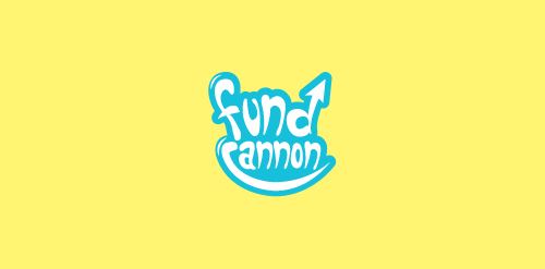
Logo design for a Fun & Creative Funding Platform.

Arabic fast Food Brazil

This is logo for newest HTML template.
This is concept of fictional brand.

Strawberry Assurance is a consultancy firm specialising in risk assessments, security, installation and disaster recovery of IT systems and networks. The logo mark was constructed using triangular shapes to represent the 3 point process in which Strawberry Assurance operates: risk assessment, undertake required tasks to secure IT systems and provide in-house training to the organisation where applicable. The bold angular shape of the mark combined with a carefully selected logo type and colour palette provides the company a with a powerful and authority presence whilst remaining friendly and approachable.

Just for fun

Logo For neighborhood bar.

Was done for fun.

Identity for it-company. Title Insoft stands - as Intelectual Soft

Logo concept for a freelance photographer.

Logo for a family history service. The heart represents the connection of loved ones from a families past, uncovered by searching through history—the book.

Creative logo for funeral bureau

Logo for interior designer/stylist Susie Herbert Light depicting house martin bird.

Mark created for an independent photographer and motion picture guru.

361º does just that little bit more during the organization of events. They do offer more than 360º degrees. It's the one degree that matters.

Waldfein means "fine forest" - a signet for a little lumberjack company

Colorful snacks for kiddies.

cat logotype

Mark created for a CPA and Financial Guru that utilizes a "friendly lion" that's face is formed out of two j's facing back to back.

Logo for a natural, earth-minded personal care product line. The mark utilizes four leaves that hosts a spiritual burst within the negative space in the center of the mark.

Just for fun

Logo concept around education and learning.