Featured logos
Featured logos – Page 168
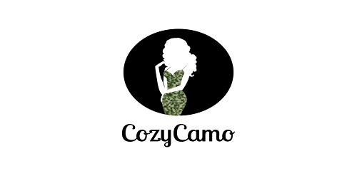
Clean design featuring a model wearing a camo dress


HL monogram for Interior stylist and designer.


Logo designed for dental salon

Australia's best yoghurt sells what it says. The design reads the letters ABY as well as a yummy expression.
Logo for a food blog.

Ambigram

That logo was designed to a User eXperience event

Ready made logo.

SCHOOL PROJECT, MORE IN FEBRUARY ambigram (sign)

Hey! We want to introduce to the amazing project we were doing for a while. This is a logo design for internet shop selling natural and hand made goods for kids, home.

The 'mark' is a combination of a various stylized elements: female torso (heart shaped), pencil top, wings, arrow (fletching - book, shaft), crib.
(MMDP - Minority Matchmakers and Dating Professionals ALL RIGHTS RESERVED)

Ambigram
A painted horse graphic is combined with a film shape. Overall icon represents freedom, calmness, and good feeling.
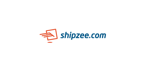
Hi, friends! My new logo for transatlantic shipping company, icon symbolizes package and wings, which means fast and secure service.

Logo for pharmaceutical company
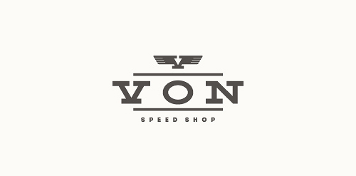
Logo for a small scooter and motorcycle shop.
PRA in English means PRE or before. The logo reflects the company's commitment to details from the early stage of design process. The logo shapes and typo constructed from a specific grid system (that later used as a graphic element) and also suggest perspective. Positive and negative space.

Proposal for a website that features 'dress up' games for girls.

This is a logo for a pharmaceutical company specializing in cardiac preparations.

Hand made lettering for Sweet Spoon. Sweet Spoon is a Frozen Yogurt shop which is also especialized in doing some other sweet stuff like cupcakes, cakepops, crepes, cronuts and more. So, take your spoon and have a sweet day!

Mushroom restaurant

Logo for the Palestinian Chamber of Commerce and Industry - Ramallah, Palestine (Government Facility)

Newport Parish Council, on the Isle of Wight (UK), is holding an ‘in bloom’ competition in 2012 with a difference! Instead of judging gardens on how many flowers it has, or how glamorous it is, they are encouraging Newport and Carisbrooke’s residents to grow gardens that are good for wildlife and for the environment.

Copy house and service for all things copiers & printers.