Featured logos
Featured logos – Page 166

Logo for a dog lover community.


logo design for small beauty salon
Logo for music club
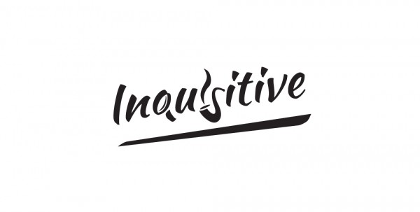
An image makes a thousand words. The magnifying glass, the pipe and its smoke send you thinking at Sherlock Holmes, the most inquisitive literature hero. They also fit pretty well as the letters in the text.

Logo for translations & teaching agency, specialized in Dutch language. The initial N icon represents the transition & transformation of one language to another.
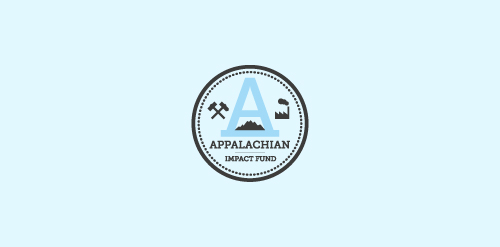
A concept made for a investment fund in the appalachian region - strong mark showing the past and the future of the region - coal mines, factories, business ect.

Diamonds Bastards
A premium logo based on food which can be used for any restaurant or any hotel where food get serve.

Unused concept. Just for fun.
This logo is for a service for create toolbars, named One Click Bar.

A logo prepared for the new football powerhouse - Panthers Wrocław.
Full presentation on Behance:
http://www.behance.net/gallery/Panthers-Wroclaw/12085907
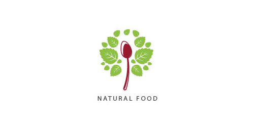
Natural Food logo stylized with green leaves and a curve spoon. Perfect logo for many categories relates with vegetables, healthy food.
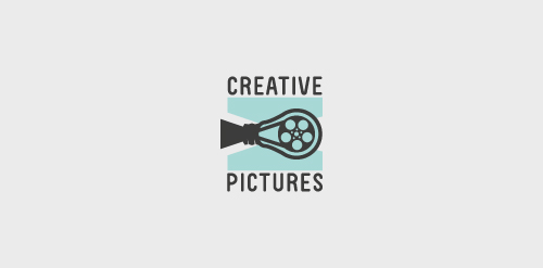
another concept using the film bulb.

Hey! Here you can see a logo design proposal for company called "HIVE". The main idea behind logo design exploration process is "HIVE's" increasing variety of services which are diverse but combines to a whole experience for a client. We were asked to creatively present hexagonal shape, and we came up with bright and vivid color palette and this developed into a pattern (the background in this shot).

Logo concept for a boutique consulting agency.

.

Hello designers! how are you doing? what have you been up to? This shot shows a logo concept for "The Sticker Club".

paR

Restaurant Marocain
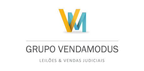
Grupo Venda Modus is a housing and auctioning group. Spot Creative Media designed the new identity, refreshed and updated their current website.

Custom Logo for a healthcare website.

s and g monogram for a client based in Netherlands who provides consultancy for public sector. The client was fascinated by my own logo https://www.logomoose.com/logo-design/samadara-ginige/. And wanted a similar design. I have made it to be similar at the same time to be different.
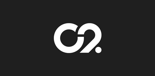
The city of Torcy, France recently built a great complex dedicated to the promotion of Culture & Arts, highlighting local and national artists. I was contacted to work on its complete Brand Identity, including Naming, Logotype, visual identity, Print communication, exterior & interior signage, website design and clothing.
The main goal was to create a total new and innovative identity. Naming took a great part in that sense. I focused on trying to create a simple yet effective name for that building. C2 was chosen from a couple of hundred names for its international recognition, pronunciation and readibility. It stands simply for Cultural Center or the two initials 2xC -> C2.
As far as the logo is concerned, it followed in a logical way the naming process. A will to create a modern and contemporary logotype, yet efficient, minimal, powerful and durable. It was created so it could nicely fit and be readable at a great or tiny size on any document. The logotype guidelines show a slight dipping of the « C » and the « . » to create the optical illusion that all characters are aligned on the same baseline.

Logo suits well for any business related to handicraft.