Minternet Web Design
Minternet Web Design


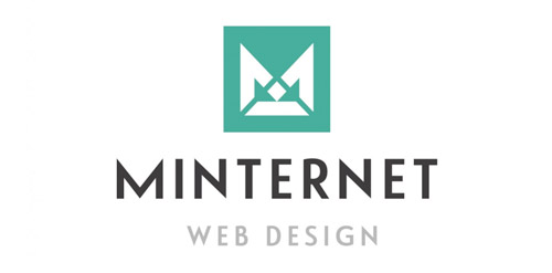
- Minternet, is the Web Design and Development company from Mike Munro. The logo has been designed to represent communication and collaboration between developer and client to create a diamond product. Within the negative space, directional arrows split to represent web development.
 Designer: Ian Paget
 - Submitted: 02/21/2014 • Featured: 03/19/2014
- Stats: This logo design has 5646 views and is 0 times added to someone's favorites. It has 4 votes with an average of 3.75 out of 5.
Designer