LogoMoose
  • Logo
    Galleries
    • Featured logos
    • Most rated logos
    • Most viewed logos
  • Identity
    Galleries
    • Featured identities
  • Packaging
    Galleries
    • Featured Packaging
  • Designers
  • Competition
  • Upload
  • Become Member
  • Login

Mike Starczewski

  Mike Starczewski  
Mike Starczewski
Facebook
fb-share-icon
Pinterest
Reddit
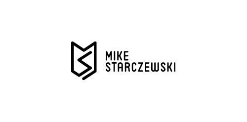
  • Personal monogram mark with type for fellow designer and US army war vet Mike StarczewskiMike Starczewski Designer: designabot
  • Submitted: 09/18/2012  •   Featured: 10/17/2012
  • Stats: This logo design has 5186 views and is 0 times added to someone's favorites. It has 8 votes with an average of 3.63 out of 5.
  • army
  • black
  • designabot
  • designer
  • logo
  • monochrome
  • monogram
  • veteran
  • white
  Designer  

designabot

View portfolio

  More logo design  
Savael

Top of the shelf design by Savael. This renewed logo has a better feel with his font, colors and kerning.

savaelComments0Jun-03-11
Alter Ego

Logotipo para una agencia de publicidad, el logotipo expresa de manera gráfica el concepto del alter ego, potenciado por medio del color. y hacer valer la promesa de la agencia a las marcas y productos de sus clientes.

fidelogComments0Mar-21-14
Harvest Bible Church

Brand and logo redesign for the Harvest Bible Church Logo.
The main challenge was to somehow link in the notion of harvest with the uber symbolic cross whilst keeping this particular church logo free of the visual cliches that often accompany many church logos.
I was approached by the Harvest Bible Church after they had seen the general style of my existing logo portfolio, so this was also a determining factor with the design style. A clean, smart, well defined church logo design was what this client was seeking.
The idea you see is basically formed from the imperfect lines of a soon to be harvest field, but also draws on the idea of a recently ploughed field which sets the beginning and creation of the crop cycle.
The horizontal and vertical lines converge creating this square/hatched shape which provides for a meaningful link to that one place where people will ultimately converge: the church.

thelogosmithComments0Aug-23-14
3 Sevens

almosh82Comments2Jun-30-09

  About  

LogoMoose is an inspiration and design community that was launched in 2008. It showcases logos, identities and packaging submitted by professional designers, design studios or agencies. We showcase the best work from the best designers from around the globe. Become a member now and create your own portfolio!

Get your daily dose of inspiration to work on your own design projects and get your business moving. Be amazed by our logos, identities and packaging on this worldwide platform. We‘re here to inspire you and help you impress your clients and fellow designers. Get an overview of global trends in logos, identities and packaging. Browse our galleries and discover all the latest design trends.
We know you love your work!

© 2008 - 2025 LogoMoose.com - All logos are property of their respective owners.
FAQ - Privacy Policy - Imprint