LogoMoose
  • Logo
    Galleries
    • Featured logos
    • Most rated logos
    • Most viewed logos
  • Identity
    Galleries
    • Featured identities
  • Packaging
    Galleries
    • Featured Packaging
  • Designers
  • Competition
  • Upload
  • Become Member
  • Login

Lions Gate Mortgage

  Lions Gate Mortgage  
Lions Gate Mortgage
Facebook
fb-share-icon
Pinterest
Reddit
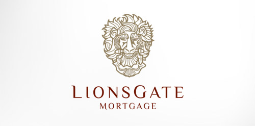
  • Antique, ornate, brass lion head door knocker logo for a growing and expanding mortgage company that wanted a new look, name, brand and image for their company. The brass knocker represents the entry way into the threshold of the home and the comfort a home signifies.Lions Gate Mortgage Designer: UtahRugbyGuy
  • Submitted: 09/04/2011  •   Featured: 10/02/2011
  • Stats: This logo design has 9943 views and is 0 times added to someone's favorites. It has 10 votes with an average of 3.60 out of 5.
  • advertising
  • alive
  • apartment
  • bold
  • brand
  • branding
  • brass
  • burkholz
  • chimney
  • city
  • comfort
  • condo
  • condominium
  • created
  • creative
  • custom
  • cut
  • cutout
  • design
  • development
  • door
  • doors
  • drawn
  • enclosure
  • estate
  • family
  • foliage
  • glow
  • Gold
  • graphic
  • hand
  • heavy
  • helius
  • home
  • house
  • icon
  • knock
  • knockout
  • Lake
  • leaf
  • leaves
  • lights
  • limbs
  • lion
  • logo
  • love
  • mark
  • oak
  • paint
  • patina
  • peak
  • real
  • reverse
  • rod
  • rodney
  • Roof
  • Salt
  • seal
  • silhouette
  • strong
  • symbol
  • tarnish
  • tree
  • trunk
  • UT
  • Utah
  • UtahRugbyGuy
  • varnish
  • windows
  Designer  

Beerz

View portfolio

  More logo design  
Coalesce Creative

guestComments0Jun-12-09
Abdulaziz Suliman

My new personal logo. Full project on Behance: http://www.behance.net/gallery/Self-Logo/1470725

iabdulazizComments3Jun-01-11
Woodin + Associates

This logo successfully represents this land developing and civil engineering firm as a contemporary business with their eye on the future. The mark is inspired by a standard target tool used in their industries. Because the majority of W+A’s clients are from within these industries, this provides an excellent communication. The negative space from within the typography creates the “+” in the name, but also serves as a crosshair, as seen in the tools of their trade.

geoffstudioComments0May-16-11
Festiwal Dobrego Smaku

Logo for Good Taste Festival - Polish nationwide culinary contest for restaurants.

ortografikaComments0Jun-08-11

  About  

LogoMoose is an inspiration and design community that was launched in 2008. It showcases logos, identities and packaging submitted by professional designers, design studios or agencies. We showcase the best work from the best designers from around the globe. Become a member now and create your own portfolio!

Get your daily dose of inspiration to work on your own design projects and get your business moving. Be amazed by our logos, identities and packaging on this worldwide platform. We‘re here to inspire you and help you impress your clients and fellow designers. Get an overview of global trends in logos, identities and packaging. Browse our galleries and discover all the latest design trends.
We know you love your work!

© 2008 - 2026 LogoMoose.com - All logos are property of their respective owners.
FAQ - Privacy Policy - Imprint