Apartment logos (9)

Logo for apartment rental web service


Miodowa is the name of the residential estate at Miodowa street in Wroclaw. Miodowa is an adjective used to describe something that tastes like honey. That is why we join 3 themes in the logo: honeycomb, architectural design and letter M.
Designer: Piotr Ploch
Logo Proposal made for signaling academic class work.

Designer: Denis Aristov Client: PM-Development Ltd. Industry: Housing Estate Keywords: development, sun, city, house, apartment, building, yellow, round

Designer: Denis Aristov Client: Ural Investment Agency Industry: Housing Estate Keywords: housing estate, development, building, apartment, silhouette, Napoleon, Bonaparte, black and white
Designer: Denis Aristov Client: Comstrin Industry: Real Estate Keywords: housing, estate, development, building, apartment, modern
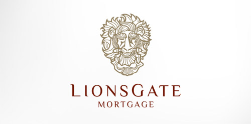
Antique, ornate, brass lion head door knocker logo for a growing and expanding mortgage company that wanted a new look, name, brand and image for their company. The brass knocker represents the entry way into the threshold of the home and the comfort a home signifies.
Logo for an apartment complex in South Carolina, USA