Organic logos (43)
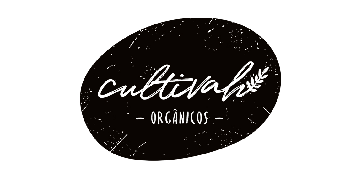
The lettering constructed irregularly, as if it had been drawn by hand, expresses the organic aesthetics of Cultivah. The branch, which extends throughout the lettering, as if it had germinated, contemplates the main product of the company, the one of vegetal origin. Finally, the noises present throughout the brand, its imperfections, illustrate the in natura language of business, free from external agents and conceived in its purest form.
Bold, prominent and clever logo concept based on bison as main element and mountains on his back. Symbolizing preservation of the nature, environment and animal species.
"Frischlich" is a German brand, with the word "Frisch" meaning "fresh" and "lich" in German is an ending for adjectives, "glücklich" = happy or "herrlich" = great. The company delivers fresh produce, meats and cheeses and more to your doorstep, tailored to your family size.
Mark concept proposal for small family business Perga+. A company engaged in the bee bread "Perga" production and trade.
A sign promoting a free Organic Food icon set – https://www.behance.net/gallery/24471401/Organic-Food-Free-Icon-Set
Logo for the brand dermatological remedies, made from natural ingredients, to industrial workers.
The identity of the builder JIMAV is based on the inspiration that we had with organic architecture. With curved forms we achieved a symbol with plenty life, which is balanced with a simple, legible and solid typography. The logo is a form developed with the approach of the letter “J” of Jiménez and the letter “A”of Avelar, which compound the name of the builder JIMAV. We developed a variety of the logo’s versions and compositions for the use in different applications and to make easier it’s reproduction.
"Project developed for the architect Fabricia Cortina, where the inspiration for the brand development was based on the French Curve ruler, an important element of Architecture.”
Organic Bracelets produced with materials just by the nature and given by the earth.
The logo shows a dancing aborigine.
Every muscle of the human form is made from Leafs that represent the Organic muscle's we were careful about the human muscle position.
Unused proposal for an Australian Cotton Farm. The logomark represents cotton fields and the textile industry.
Our logo inspiration gallery will give you the creative boost you're looking for. Get your daily dose of logo design inspiration to work on your own logo design projects and get your business going. Be amazed by our logo designers and their brand guidelines. We are here to help you impress your clients and our fellow designers. Professionalize your logo design skills and get yourself to a new level. Browse our logo design gallery and discover all the new logo design trends and much more. We know you love logos!
