450gsm
450gsm


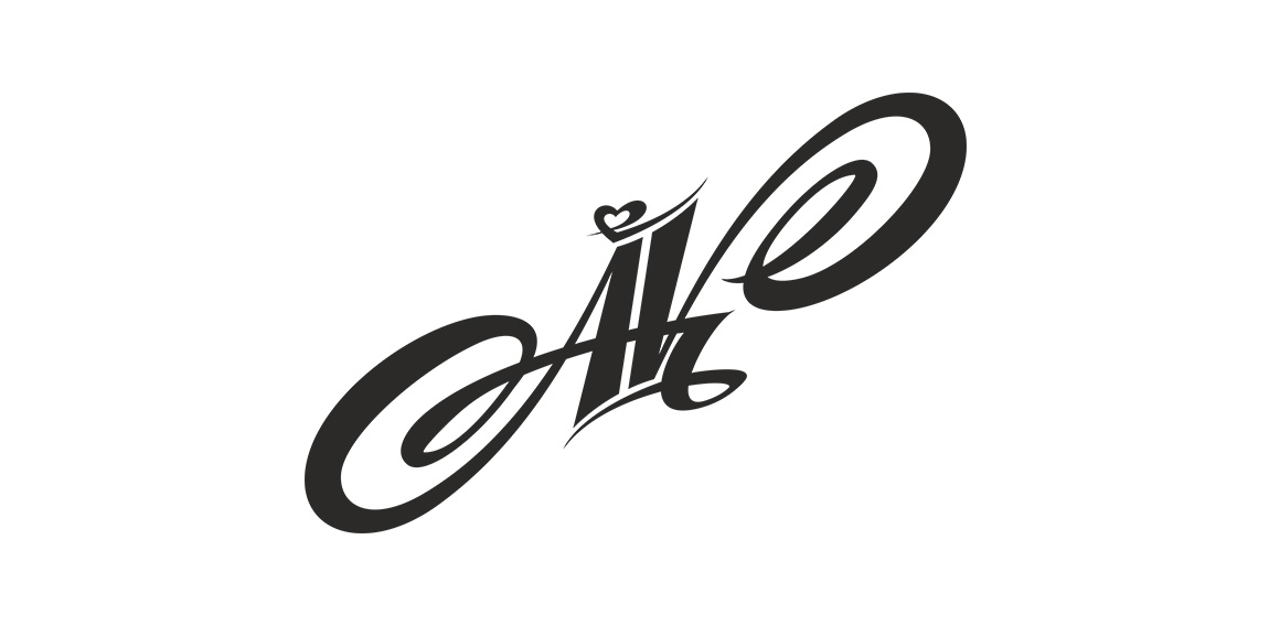
- Logotype made for little printhouse from UK.
The heart refers to the passion with which they indulge in their work; folded element ambiguosly refers to paper.
 Designer: alekchmura
 - Submitted: 10/13/2014 • Featured: 11/21/2014
- Stats: This logo design has 7115 views and is 1 times added to someone's favorites. It has 2 votes with an average of 2.50 out of 5.