LogoMoose
  • Logo
    Galleries
    • Featured logos
    • Most rated logos
    • Most viewed logos
  • Identity
    Galleries
    • Featured identities
  • Packaging
    Galleries
    • Featured Packaging
  • Designers
  • Competition
  • Upload
  • Become Member
  • Login

Selecore

  Selecore  
Selecore
Facebook
fb-share-icon
Pinterest
Reddit
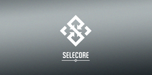
  • Selecore is company located in Finland, primarily focusing on importing new innovative products and secondary focus is in exporting items produced in Finland. Client wanted serious, modern and strong logo. He also mentioned that he loves when the logo has a hidden feature or message.
    In the mark letter "S" is made of arrows pointing inside (import). In the negative space you can see arrows pointing out(export). The negative space also forms a cross which is connection to Finnish flag. Selecore Designer: balic
  • Submitted: 03/27/2012  •   Featured: 05/07/2012
  • Stats: This logo design has 7727 views and is 0 times added to someone's favorites. It has 8 votes with an average of 3.75 out of 5.
  • arrow
  • arrows
  • balic
  • black
  • core
  • cross
  • export
  • finland
  • finnish
  • import
  • inside
  • logo
  • modern
  • negative
  • negative space
  • outside
  • pointing
  • S
  • selecore
  • selected
  • space
  • strong
  • white
  Designer  

balic

View portfolio

  More logo design  
Stanovov Stanislav Sergeevich

guestComments1Jun-26-09
TheMoose

TheMoose

kreatankComments0Sep-22-15
ADELE HOMESTEAD

Logo design for a subsistence farm, Ghana. "The project is for a farm in Ghana, run by and on behalf of an orphanage, now in the third generation. The farm will grow vegetables and possibly fruit for their own use and that of a larger orphanage in Africa. Within a year, there will be enough produce to start providing some of the surrounding countries (Togoland, Burkina Faso, Mali, etc) with vegetables and fruit. The soil is fertile, the climate good; and as soon as a well is dug, there will be adequate water, and crops will be grown, year round. The image that I'd like to convey is one of family, best of natural fresh vegetables and fruits, healthy; planted tended and harvested by hand by the boys, girls and me n (all orphans of different generations) who work on the farm."

vasvariComments0Jul-30-13
epiccomments

EpicComments is a site/blog that captures what the internet is saying in its honest mostly comical/funny way.

alexwendeComments3Sep-27-11

  About  

LogoMoose is an inspiration and design community that was launched in 2008. It showcases logos, identities and packaging submitted by professional designers, design studios or agencies. We showcase the best work from the best designers from around the globe. Become a member now and create your own portfolio!

Get your daily dose of inspiration to work on your own design projects and get your business moving. Be amazed by our logos, identities and packaging on this worldwide platform. We‘re here to inspire you and help you impress your clients and fellow designers. Get an overview of global trends in logos, identities and packaging. Browse our galleries and discover all the latest design trends.
We know you love your work!

© 2008 - 2026 LogoMoose.com - All logos are property of their respective owners.
FAQ - Privacy Policy - Imprint