LogoMoose Logo Inspiration
  • Logo
    Galleries
    • Featured logos
    • Most rated logos
    • Most viewed logos
  • Identity
    Galleries
    • Featured identities
  • Packaging
    Galleries
    • Featured Packaging
  • Designers
  • Upload
  • Become Member
  • Login

The Kooks

  The Kooks  

The Kooks
Facebook
fb-share-icon
Pinterest
Reddit
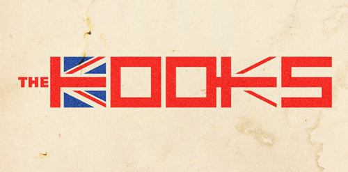
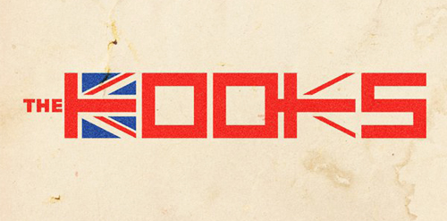
  • Just a draft idea for British band The Kooks as part of an international design competition that resulted in a second place for me.The Kooks Designer: rensdekker
  • Submitted: 06/19/2011  •   Featured: 07/01/2011
  • Stats: This logo design has 7984 views and is 0 times added to someone's favorites. It has 15 votes with an average of 3.67 out of 5.
  • Artist
  • band
  • Brighton
  • British
  • custom
  • England
  • English
  • flag
  • Great Britain
  • indie
  • music
  • musicians
  • pop
  • rensdekker
  • rock
  • The Kooks
  • type
  • typography

  Designer  

rensdekker

View portfolio

  More logo design  

BRUTHAN

The visual identity project developed for the company specialized in Tenders & Distribution, in Florianópolis - Brazil, aimed to reinforce the concepts of excellence and trust, pertinent to the business. With the use of an exclusive typography and a symbol with a modern design, consisting of a continuous line, referring to its broad and solid performance, the company is moving towards its goal of obtaining national prominence.

headmadeComments0May-07-17
refresher.sk

Most popular lifestyle portal in Slovakia and Czech Republic. Keeping you FRESH since 2011. The client approached me to redesign theirs logo. Refresher.sk need new logo that will reflect a primary activity. So I was looking for a way to simplify the logo, but also to have supported the idea and objectives of the portal. Gist for Logomark I chose symbol refresh, as you know for example, web browsers (symbol I wanted to get into logos peacefully and therefore I chose negative space), it is added to the symbol of conversation (bubble), which can be further used in communication portal (printed materials, merchandising, etc.), and the letter R. Scripture for the logo, I chose Helvetica. It is distinctive, timeless and elegant, expressing emotion is just FRESH :)

miro-kozelComments0Dec-25-13
LittleLEO

Children's trademark

13muComments2Mar-08-11
Authentic

The AUthentic logo design resembles the map of Australia. It presents a strongly formed approach suitable in the coffee roasting industry. With this new brand name, you can establish new position in the coffee industry.

knyleComments0Jan-23-15

  About  

Logo Inspiration showcases logos, identities and packaging
We are an inspiration and design community that was founded in 2008.
Here, we showcase logos, brand identities and packaging designs created by professional designers, design studios and agencies. We showcase the best work from the best designers from
Join us and upload your work! Register here!

© 2008 - 2026 LogoMoose.com - All logos are property of their respective owners.
FAQ - Privacy Policy - Imprint