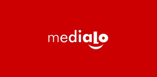
LogoMoose
  • Logo
    Galleries
    • Featured logos
    • Most rated logos
    • Most viewed logos
  • Identity
    Galleries
    • Featured identities
  • Packaging
    Galleries
    • Featured Packaging
  • Designers
  • Competition
  • Upload
  • Become Member
  • Login

Medialo_1

  Medialo_1  
Medialo_1
Facebook
fb-share-icon
Pinterest
Reddit
  • Marketing agency. One of initial proposals presented to the client. Face hidden in lettering and underscored with a smile may not be a revelation, but it still works pretty well. Gradual increasing of letter`s weight directs viewer to the face and in a way symbolizes company`s job - magnifying marketing message of their clients. Medialo_1 Designer: midgar
  • Submitted: 03/29/2011  •   Featured: 10/14/2013
  • Stats: This logo design has 4599 views and is 0 times added to someone's favorites. It has 4 votes with an average of 2.50 out of 5.
  • advertisement
  • face
  • Marketing
  • midgar
  • ruszel
  • smile
  • typography
  • wordmark
  Designer  

midgar

View portfolio

  More logo design  
Deappetizer.com

Logo was created for site deappetizer.com. Deappetizer.com is for people, who used to eat a lot, but decided to do something to reduce their appetite. Idea is simple and clever in my opinion: the site presents unpleasant pictures, which should spoil your appetite. And before a meal you can visit this site to change your perception of food for a while. All of the pictures are divided into three levels by their effect. The further the stronger. Concept: imagine that «Deappetizier» is very unusual restaurant, where guests come to refrain from eating, so the primary duty of a waiter is not to allow a guest to eat. All the waiter’s efforts to discourage guest’s appetite formed the basis for a series of logos for each level of pictures: Level 1 https://www.logomoose.com/members/alisa1711/showcase/logo/244/ Level 2 https://www.logomoose.com/members/alisa1711/showcase/logo/245/ Level 3 https://www.logomoose.com/members/alisa1711/showcase/logo/246/ Also you can see logo in bigger size and on the white background at http://revision.ru/work/36475/

alisa1711Comments2Dec-15-10
flash film media

unused logo proposal for flash film media

pujianto95Comments0Jul-18-16
EkoCare

Hands and leaves in negative space.

jandsComments4Dec-27-11
Mekong On Wheels

Mekong, a small 24 year old Thai restaurant in Midvale, Utah, was in need of a new identity for their newly purchased food truck. I created a logo to convey a reputable company that is more "trendy, sophisticated, sleek" in all a more modern look for 2015. The owners wanted to use a elephant, symbolic of "good luck", so I made a subtle trunk in the M shape along with placing a circle for the eye and wheels near the feet for a mobile aspect to this design.

chgdComments0Jan-15-15

  About  

LogoMoose is an inspiration and design community that was launched in 2008. It showcases logos, identities and packaging submitted by professional designers, design studios or agencies. We showcase the best work from the best designers from around the globe. Become a member now and create your own portfolio!

Get your daily dose of inspiration to work on your own design projects and get your business moving. Be amazed by our logos, identities and packaging on this worldwide platform. We‘re here to inspire you and help you impress your clients and fellow designers. Get an overview of global trends in logos, identities and packaging. Browse our galleries and discover all the latest design trends.
We know you love your work!

© 2008 - 2026 LogoMoose.com - All logos are property of their respective owners.
FAQ - Privacy Policy - Imprint