August 2017 logos (84)
A rebrand of logo for a local vintage/hi-end furniture producer. The logo contains symbolic od "saw/teeth" and looks a bit luxurious also if you imagine the logo on the actual products. Which makes the brand and it´s product very special and original.


Crimson Kings eSports Logo.

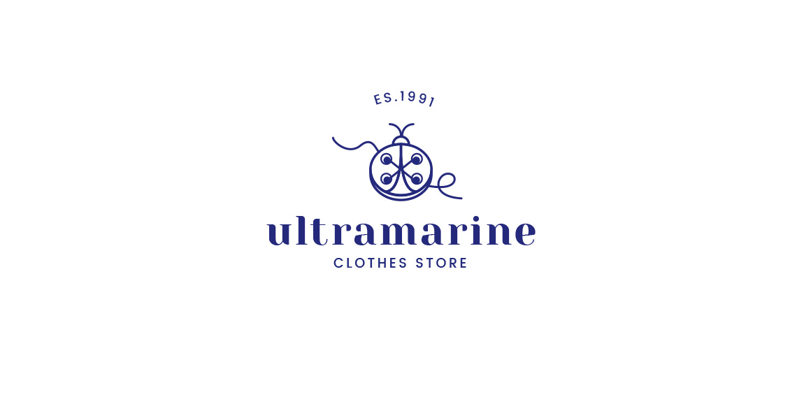
I'd like to show you logo which I done for local clothes store. Main idea was to connect two symbols button and ladybug, that was client requirements.

New logo for tennis club
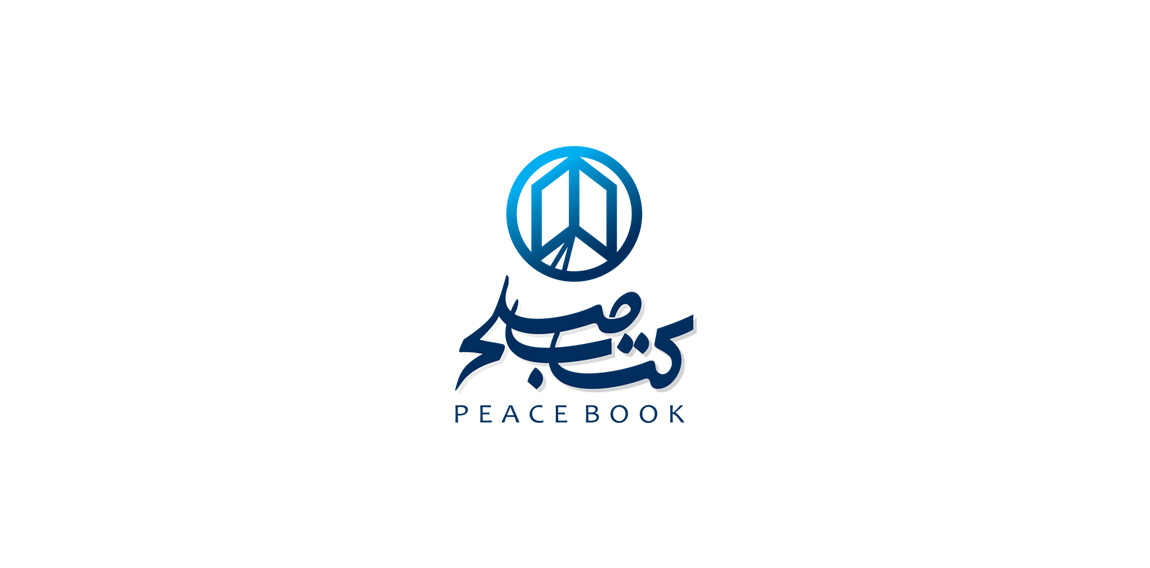
Book store
Just vectorized sketch from my sketchbook :) more at: https://www.behance.net/gallery/33949050/Logos-pack04

A Judo Sports Club in Austria/ Vienna For Basic Judo Trainers. "Awiar" is the name of a mountain
I decided to challenge myself to create logotypes everyday with random words.
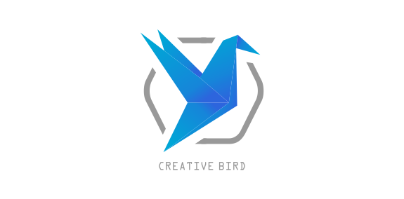
Creative Bird Social Media Campo Grande, Brazil
.

Brand Amy Maia Alta Costura Patos de Minas, Brazil
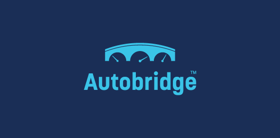
Bridge +car dashboard

2017

dental clinic
Old personal logo.

The logo has the concept of joining the letter H with the hexagon. This union of the two elements occurs in a fluid and joint way, making both a symbol only. The graphical effects used give the symbol depth and dimension. For lettering, an easy-to-read format was designed , which refers to the technology area. Details in each letter and adjustments give the feeling of agility and exclusivity to the name of the company.

New Zealand based ad agency.
A new brand for women wear located in Cairo, Egypt