2013 logos (1699)
Jewelry store


Real estate blog in Los Angeles

An idea studio and multi-purpose vintage furniture store

Polish software house strongly devoted to Research & Development in cutting-edge telecommunication solutions.
Created for fun only
Logo for design company.
www.mikemark.com We needed a logo that would remind us of the broken marbles from the ancient Greek agora, a place to sell and buy, speak and debate, meet and learn. We thought that our logo version of agora should be colourful as a way to express hope, happy motives and uniqueness. We loved the idea of a circular logo because we needed balance and because we thought that this project should roll.

Beauty products seller.

Design Company

Consulting

Medical comunity online.

Spa and wellness. Body and soul.

Beauty company. Kelebek means butterfly in turkish.

Company which sells dog products.
Online wines seller.
Better version of the new logo for call unmask company Unmask ID.

Logo for the dietary studio from Poland. Frais means healthy and fresh in French.

design studio

new logo for lynda .com
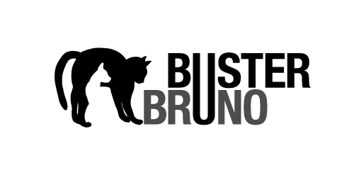
This is a personal project to create a positive/negative identity for a typographic illustrative children’s book called Buster Bruno.
Simple use of the distinctive profiles of Buster and Bruno my two cats uses the negative/positive space to created logo mark. The linking of the u from both words unites the two cats as they are brothers.