June 2013 logos (170)
Brand for creative agency, design agency and similar.


Pinero Classico Logotype
Logo for paiting company.
Logo designed for an artificial grass company

Galaxic- music and video clips search custom type http://www.facebook.com/yaceky

Sreca je u nama (Happiness is within us) The brief was to create logo for life coach and art of living workshop "Happiness is within us" and to use posture that symbolizes happiness. www.lifecentar.com The idea Happiness posture + butterfly + tree The logo is combination of asana that represents happiness presented through the symbols of butterfly and tree. Butterfly symbolizes change (metamorphosis), and in Japan is considered to represent one's soul. Tree symbolizes stability, longevity, and strength. Connection of mind and body is shown through these symbols. Energy vital points on the body are colored in gold: feet, palms, heart, third eye and point below navel.

Logo design for non-profit organization.The logo was inspired from mothers around the world and affection and love for their children.I just tried to communicate that feeling with this design
Logo for movie site.
This logo represents the water colors on a swimming pool, the shapes also want to translate the waves and the different formats of the swimming pool .

Logo for wine producer.

Logo designed for secret revealing website.
Logo for beer delivery.
Logo for design company.

great logo for learning
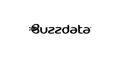
BuzzData is a social platform/network where you can publish and discuss data. BuzzData lets you publish your data in a smarter, easier way. It's about data and a part of it to visualize the information. You can attach articles, visualizations, apps and even source code... etc. www.buzzdata.com Identity solution: A custom made uniqe Typography with a varying thickness shows buzz and motion. The front letter "B"ee can also be used as a standalone favicon which is very important for a social network company since it is easier to incorporate it in very small sizes around the web for buttons and links. The Bee has a uniqe shape, is very memorable and iconic. The colors which are used into the negative space of the bee are resembling the companies main product >data< which comes from the social network users in unlimited variations... everyone can publish and discuss data. The color forms are reminiscent of chart bars, pies (statistics).

willy from the movie this one is better
Logo designed for a New Zealand clothing label.

Shale Fabrication Logo was designed as a concept for metal fabrication shops, especially related to construction industry. The logo uses red and black colors and sharp edges to signify strength, stability and sharpness. You can download the free vector from here : http://heavylogos.com/shale-fabrication-construction-logo/

For a local anesthesiologist team in the ulm. They wanted the town's landmark incorporated somehow in the logo. The Minister of ulm is the tallest church in the world. For those who don't know the landmark of ulm follow this link for more information: http://en.wikipedia.org/wiki/Ulm_Minster