

2012 logos (1821)
logo i use to represent myself all over the web. hope you like it.

 2Feb-20-12


Travel agency
 1Feb-20-12
I designed this logo for the VSO while working at Valdosta State University
 0Feb-20-12
An "Alpha" letter which contains a storm inside ,to represent the company name (Alpha Storms)
 1Feb-20-12
Frozen yogurt shop in Macau. At first, we had tried to go with something more gentle, smooth and subtle (to match yogurt`s creamy texture), but it turned out that the client prefers a heavier, less refined approach.
This is a design based on client`s own sketch.
 0Feb-19-12
Elite High School
 1Feb-19-12
Web-shop for girls
0Feb-19-12
Lettering practice
0Feb-18-12
For a iPhone app development company
 0Feb-18-12
Chamelion- HD Experiments
 0Feb-17-12
Pure Sounds - logo for a website about classical music
 0Feb-17-12
Logotype for photographer freelance
 1Feb-17-12
sign is designed for scientific and practical journal "Current Research"
 1Feb-17-12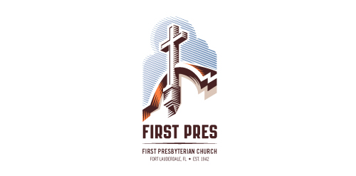
Redesign of the church's old logo in a stylized, illustrative manner, making it more welcoming, contemporary, friendly, casual, & upbeat. Client specified a rendering of the church’s architectural arch and cross in the perspective in this photo, and required an emphasis on the church's nickname, “First Pres."
Here, crisp, exacting vectors emphasize the architectural soundness of the church — a metaphor for the concept of faith as the solid foundation in one's life. This design makes use of hatching to add gradient dimensionality, enabling it to easily reduce down to 1-color. Colors are indicative of the building itself, including terracotta roof. Check my Flickr case study or Dribbble for more images, detail, and full design rationale.
 2Feb-16-12