White logos (128)
An idea studio and multi-purpose vintage furniture store


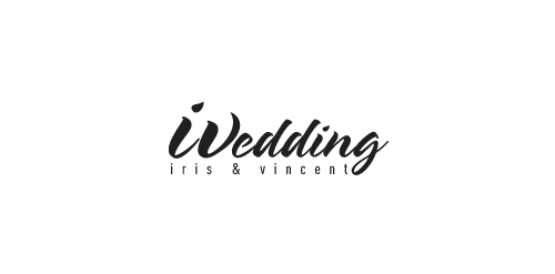
Combining the letter of "i" and the letter of "V" to be the first letter of wedding (W). This logo is for the wedding of Iris & Vincent
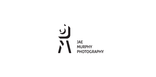
Logo for photographer from USA, California.
J, M, camera and tripod in negative space.


Polish Golf Union logo redeign.
A logo for a new hair salon in The Netherlands
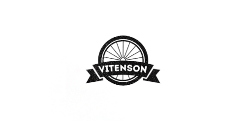
Logo concept for company which creates unique bicycles. Client requested some vintage and retro mood.
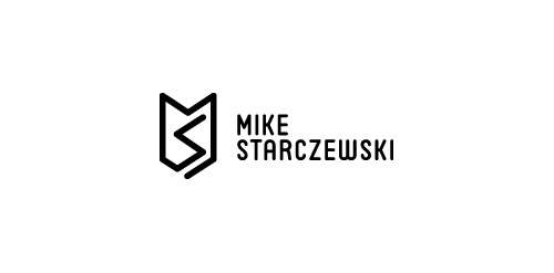
Personal monogram mark with type for fellow designer and US army war vet Mike Starczewski

Beltway Brewing

Logomilk.com The usp with the Logo Milk gallery is that all logos submitted are in black and white. In-fact the whole site is monochromatic making it very distinct.

Company sells English thoroughbred racing horses. Client wants royal, imperial look.
Dance City (Šokių miestas) - Dance Studio Logo

Logotype created for a women's online fashion website.
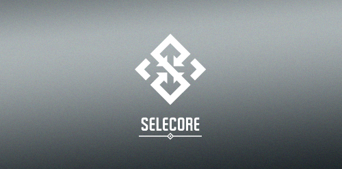
Selecore is company located in Finland, primarily focusing on importing new innovative products and secondary focus is in exporting items produced in Finland. Client wanted serious, modern and strong logo. He also mentioned that he loves when the logo has a hidden feature or message.
In the mark letter "S" is made of arrows pointing inside (import). In the negative space you can see arrows pointing out(export). The negative space also forms a cross which is connection to Finnish flag.
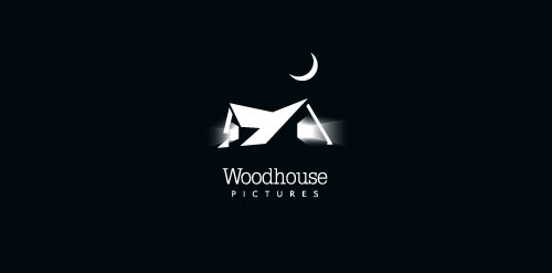
Created for an independent film company.

a logo made for a portal with info, documents and tips on interviewing both for interviewers and interviewed.
Skate-influenced brand identity for a clothing line called "Hiromi (宏美) VM (Visual Media)". The reason we decided to move on from this design was because it did capture the skate mentality and feel, and it looked nice, BUT it didn't quite capture feel of the "slim, sleek, futuristic, chic" brand the client was going for.
Nice Black Chip is a small, intelligent team of experts in fields of electronics hardware and software.
Client wanted strong, clean design in black and white.