
Trioco Graphic Design logos (26)
"The Beats Producer born from a personal project, whose goal is to bring the very best in music, regardless of musical style, always working with the idea of a movement that does not stop.”


"An element of the bicycle and an element of Whitestone (Local Store). For bicycle use the ratchet teeth 11, which symbolizes the march is more of a bike, and to White Stone, symbolized with the hill that is a landmark of refência. Together the two symbols form a rising sun, referring to the idea of a new and sustainable world.”

"The logo worked is contemporary, with a remit that was developed for clarity and seriousness. It was designed to be a geometric sans serif type, since this type has never been so ubiquitous as today, for bringing this fixed and direct American trait types nineteenth century. The concept addressed to the symbol is simple and minimalist. Seeking to blend both colors as ways that the company is capable of developing.”

Logo to a business system company.

"Iguaçu is the second biggest distributor of optical product of the South of Brasil and they were searching for the repositioning of their brand. We worked with a new communication aiming at the values of the company, which is about commitment and responsability.”

"Casa do Salame is a family company that has worked for over 15 years with handmade production of sausages and several other farm products. For the development of this brand, we added a more traditional/manufactured feel to it so that the public can feel that the products are unique and handmade. We used color tones that remind of Italy (the origin of the products and the family), and to make the handmade aspect clear, we used golden hotstamping on the materials.”

"Our goal for a study of implementation of the new brand was to be based on the ideas and key objectives of the company are: Provide industrial assembly and maintenance services with quality and efficiency, which results in a competitive price and profitability. For the development of typography, seek work in the union of metal objects of everyday business, such as pipes, metal profiles and iron sheets, thus creating a unique and solid typography.”

"At Tesla, we don’t merely design or execute projects, but develop ideas and solutions that contribute to the well being of our planet. We think and act in a sustainable way. We entered the market selling products related to sustainability, due to this recent discovery made by the society.”

100água is a company that has a special technique to develop products to clean vehicles using carnaúba wax, which uses no water. Besides protecting the environment, it also protects your car more than a regular wash.”

"The first mountain - the left one - is Mount Sajama, situated in Bolivia, the place of origin of the main ingredient of Bernino Gourmet Potato. The central mountain is Matterhorn, located in Switzerland, where the Rösti Potato was created along the canton of Bern. The White Rock is the last mountain and where Bernino Gourmet Potato will be launched, in Palhoça/SC, besides being a strong inspiration for the development of the first restaurant of this franchise.”

"We seek to refer the "S" in a caravel, indicating demand for the ideal property for each client.”

"Brand with typography designed for a law firm that works with realistic idea but to show the seriousness neoclassical added serifs to her.”
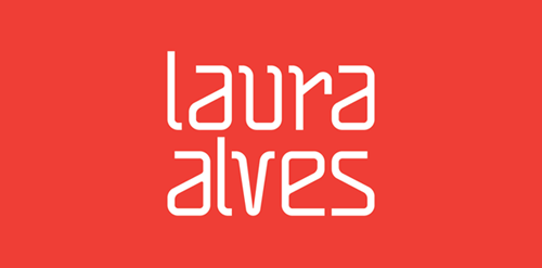
"The project for Architect and Urban Planner Laura Alves was based on the abstract forms and drafts used on a daily basis of the architect. We used orange as a color base because it inspires creativity."

"The typography was based on Art Deco of the 40s and 50’s themed cabaret was applied in all material of the bar, since the internal communication such as clothing and outdoor applications.”

"Project developed for the architect Fabricia Cortina, where the inspiration for the brand development was based on the French Curve ruler, an important element of Architecture.”

"This project is about a brand of a psychologist that works with business education. For the idea of this brand, we studied psychology, the human behavior and the cyclic idea of improvement. During our study about the client’s work, we understood that psychology is the science that studies the mental processes and behaviors. With this in mind, we developed an idea that would show the change and difference of the human being after going through this process. The colors used by the brand are clear about the improvement and humanization of the person, because we used a simple and objective melody with a salmon color and navy blue. ”