Sun logos (81)

.


:)

A logo for one of my start-ups.
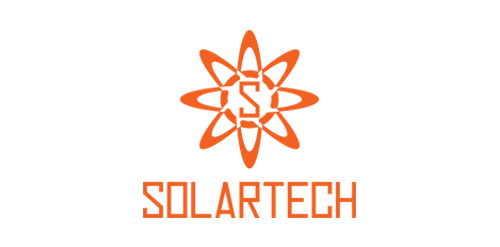
Solartech is best for business and company that uses solar energy.

.

AURORA is a brand that design and manufacture handmade scent candles. With a mission to fulfill and inspire people life's with a happiness and calmness. Idea was to design a logo that is simple and iconic. A logo that reflects their brand. Visually and emotionally warm, evoking experience of life. The iconic O letter presents rising sun ( the dawn ).

Just for fun

Натура (Nature) logo

Brand development services for entrepreneurs and small businesses. Client request for the symbol was "Sun breaking out from the center of the earth".

Sunbreak Homes, LLC is real estate company. They buy homes that need work, fix them up to make them beautiful, then list them for sale. The name of Sunbreak Homes was chosen for a special reason. They are based in Seattle, WA, where it rains all the time. So, when the sun does decide to come out from behind the clouds, everybody gets excited. It's called a "sunbreak". The imagery I had in mind for the logo is to somehow incorporate the sun's rays breaking through the clouds, keeping it simple and memorable.

Copyright © 2014 Marius Fechete

Sundial Concept Typo

A project for a travel agency NINJA travel "Japanese sun"

Music Label The harmony of the simple shapes used, the color chosen, makes clear and direct the concept behind the brand: the union of the sun, represented by a flame, more, the empty spaces game of the treble clef.

Ready made logo design.

Ready made logo design.

Logo for sailing site. www.livera.it
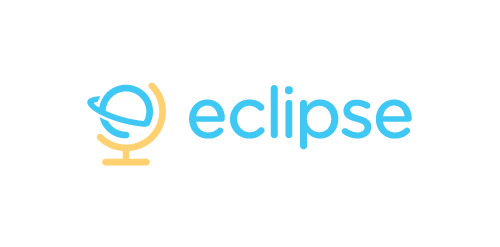
Eclipse offer specialist training software - mostly linguistic, but also teachings on grammar, syntax, etc. The use of the globe device reinforces the idea that language & communication is a ‘global’ exercise. Conceptually the design is of course inspired by a globe on its axis/stand. Since the idea of the eclipse is not necessary representative of solar or lunar, the mark focuses on how eclipses are created, orbit – The precise moment the Earth/Moon orbit is in relation to the Sun. The planet also forming an abstract E, creating a subtle monogram.

Unused proposal for an Australian Cotton Farm. The logomark represents cotton fields and the textile industry.

Just for fun. Surya = Sun

Logo concept for Canadian Home Builder project