Steel logos (9)

ALSTAL - Building


VietNam Steel Corporation specialises in producing iron and steel products.

For sale!
...

"Our goal for a study of implementation of the new brand was to be based on the ideas and key objectives of the company are: Provide industrial assembly and maintenance services with quality and efficiency, which results in a competitive price and profitability. For the development of typography, seek work in the union of metal objects of everyday business, such as pipes, metal profiles and iron sheets, thus creating a unique and solid typography.”

Shale Fabrication Logo was designed as a concept for metal fabrication shops, especially related to construction industry. The logo uses red and black colors and sharp edges to signify strength, stability and sharpness. You can download the free vector from here : http://heavylogos.com/shale-fabrication-construction-logo/

Air Conditioning
Architecture department at Białystok University of Technology. Description: simple, easy to remember and draw sign. Symbolical reference to steel bridges span, construction, modular grid. Including W&A letters. ("Wydział Architektury" Architecture Department). Symbolical imaging of 3 parts/triangles as 3 faculties: - architecture & town-planning, Interior architecture, Graphic design
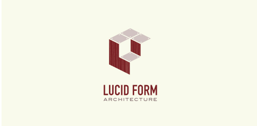
This logo is for a completely fictitious architecture studio called Lucid Form Architecture.
The icon is based on an optical illusion of a cube within a cube. Primarily, the form depicts a big cube, made of wood walls and metal-plated top surfaces, with a notch cut out of the center, resulting in a 3-D "L" shape. However, the longer one looks at this, perception begins to shift, resulting in a couple of different interpretations: 1) a small cube with a wooden wall and metal-plated bottom, in the corner of a room, hovering near the top of a tiled ceiling; 2) a room, tilted 90° clockwise, with hardwood floors, tiled walls, and a cube with a wood countertop and metal-plated side on the floor in the corner. This perception shift is important to the name, because it presents an ironic twist. To make "lucid" means to make clear, and while the icon seems to initially baffle and confuse, it ultimately encourages the viewer to challenge his or her preconceived notions of "perception." So too is the Lucid Form methodology for creating seeming impossible structures.