Star logos (90)

This is a logo for a company that delivers low-energy LED lighting solutions.


Logo for protector company

Logo for producer of high quality, handmade glassware from Poland

Party club, drink, event company

Entry for a logo competition for the famous dubstep dj Rusko

Logo for design studio.

Union Of Moscow Architects

Campers for a cause

Beltway Brewing

Logo design for Health Star

Event agency. Organization of parties
Human resources company.
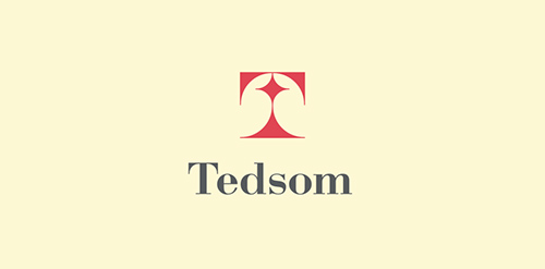
Half-symbolic, half-typographic concept. I have started with a concept of a road leading ahead, with a guiding star above, showing the way. Then, I had to add top serifs to get the letter "T", and with a little stretch of imagination it could be interpreted (or rather the negative space it creates) as the night-sky`s sphere.
I am pretty happy with the shape I have ended up with. It is purely geometric, simple, elegant, unique and strong. Of course it is also the initial of the company name, and the hidden message can be viewed as added value.
keywords: "T", professional, trustworthy, solid, experienced, elegant, simple, guidance

Videosystems

If you have problem with your brand, wee will fix it!

emigration agency, property in other countries.

store of the premium roses & other flowers
Part of our idealistic project: creating free logos for charitable, fund raising, non-profit organizations / services. (coming real soon)

Pear is a cloud-based application that integrates entertainment, fashion, travel and sport. Allowing users to have a customised interface to the web that streamlines and aggregates only what interests them. The logo encompasses representative icons from various genres and sectors and combines them under one pear-shaped roof, just like the app itself.

Custom type logo for an online tights, leggings, stockings, etc. store. Word "lumen" has meanings like - light, star, glamour, romance. In use by client. http://lumentights.co.uk

The Perfect Score : A credit repairing company.

Clothing for outdoor activities.

Family food production