Square logos (37)
Unused proposal for a recruiting agency.


Tapcanvas - site used to create mobile applications without knowledge of the programming process. Triptic created some interesting logos, from which our client selected the most accurate. Co-operation was a success - the final effect is a combination of mobile interface, paint splats and pixels which resulting in is funny, interesting, and refers to all free and easy modifications which can be made by the user. Full ID http://bit.ly/RhywhK

Fictional logo restyle for a skate store in The Netherlands
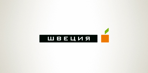
Designer: Denis Aristov Client: Sweden Group Industry: Advertising Agency Keywords: advertising agency, square, cube, apple, orange, green

Platform brings many talents together to form a solution, this is what makes up Platform - in a nutshell. The branding signifies these talents with multicoloured squares which are brought together to make up the logo and branding. The squares also form a 'platform' shape.
The main logo is ever changing and diverse. The number of squares and the colours are constant, but they rearrange from letterhead to business card to website etc., so it'll always look the same but is dynamic and evolving - just like Platform’s work.
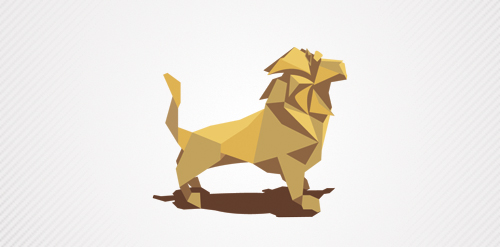
a lion created whit paper!

Simple, yet effective logo.

Strategija magazine portal about business and strategies.