Smile logos (42)
Logo that expresses smiled face within perfectly arranged letters in pixel grid. Rejected proposal.


Logo for a dentistry.
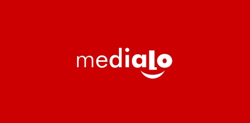
Marketing agency. One of initial proposals presented to the client. Face hidden in lettering and underscored with a smile may not be a revelation, but it still works pretty well. Gradual increasing of letter`s weight directs viewer to the face and in a way symbolizes company`s job - magnifying marketing message of their clients.

Rejected logo proposal for Indie game development house.

Having fun for a while

For fun

Logo for a dental clinic. It`s all about smiles, get it?

Logo for a company engaged in learning the German language.
Afro monkey B/

logo for web travel service
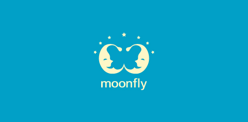
The main characters of the logo designed using positive space are two "sleepy" moons! There is however another character- hidden in the design! Seek for it!

Pear is a cloud-based application that integrates entertainment, fashion, travel and sport. Allowing users to have a customised interface to the web that streamlines and aggregates only what interests them. The logo encompasses representative icons from various genres and sectors and combines them under one pear-shaped roof, just like the app itself.
Foto is new online portal and eshop selling fotos and cameras. Black and white version. Try to made foto camera symbol simple as can be.
Fisgo Logo
smilepixel.com for media, digital design area, internet companies etc.