Round logos (43)

New and final emblem logo chosen for Ianiverse Designs. Designed by Henley Ian as one of the choices for long term identity.


Fictional logo for an Adidas-themed résumé. This is in no way affiliated with Adidas.
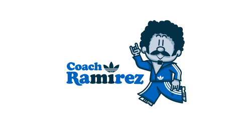
Earlier this year, Adidas Originals had an open Design Director position in their Portland HQ, and, being a lover of the brand, I decided to apply. To demonstrate not only my skills as a graphic designer, but also my knowledge and respect for the adidas brand and its legacy, I designed a self-promo booklet (a highly-conceptual adaptation of my current résumé) that is aesthetically inspired by adidas Originals marketing brochures. The booklet chronicles the accomplishments of a fictional alter-ego, Coach Ramirez — an adidas track suit wearing, afro'd, mustachioed designer — and is written as if he's actually the Design Director at adidas Originals. Sadly, I didn't get the job.
Click here to view my Flickr stream for full design rationale and additional images.


Polish software house strongly devoted to Research & Development in cutting-edge telecommunication solutions.

Rounded is a Dutch online store for hardware applications and telecommunications resources.
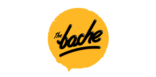
The Bache is the name of own small business in video productions and graphic design. It is pronounced as ‘The Badzje'. Little shameless self-promotion right here: www.thebache.nl
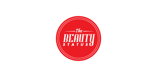
This logo was created for a hockey blog that discusses the good and bad things going on in the hockey world. The logo is meant to look like a stamp and is used to grant 'TheBeautyStatus' to certain players and teams.
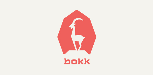
I recently realized I've never designed anything animal related. So I decided to give it a try with this ibex. The logotype was custom made and incorporates characteristics of the ibex. (The name bokk is derived from the word sprinbok.)
One of the logo concepts I did for music artist Taio Cruz.

Designer: Denis Aristov Client: PM-Development Ltd. Industry: Housing Estate Keywords: development, sun, city, house, apartment, building, yellow, round

Designer: Denis Aristov Client: Panorama Industry: Food Keywords: tapas, bar, bull, Spain, bullfights, corrida, food, red, yellow, round, arena, sun, sand, typographic, T, horns

Designer: Denis Aristov Client: Karpof Cafe Industry: Cafe Keywords: carp, fish, food, cafe, restaurant, round
Logo design for a personal project. Work in progress

Website that sells personalized chairs for kids.

old bakery that was looking for a simple logo in an old style.
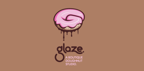
This is a totally fictional company that I refer to as "a boutique doughnut studio." I envision it as a trendy, metropolitan bakery that allows customers to glaze and decorate their own unique doughnuts. I wanted this to look really tactile, gooey, and sweet - like you really want to take a bite. Type for "glaze" is custom, and reflects the roundness of a doughnut. Click here to view my Flickr stream for full design rationale and additional images.

very strong and static symbol, shape and color transmits security force and dynamism. Matter is a simple logo but with a high potential!

Sophia Georgopoulou is a graphic designer from Athens, Greece. A logo was created based on the initials of the designer's name ('S' for Sophia and "G" for Georgopoulou, in lowercase). This logo is applied in a fresh-mint Pantone 353 C that connotes freshness and youth. The logo is compact, austere but also friendly and eye-catching.