Puzzle logos (11)
Original, 100% unique logo design with no limits in use! For sale.


Full service agency specialized in branding, marketing strategies, PR, campaigns, events and more. They combine creative thinking with strategic approach.


:)

logo conception
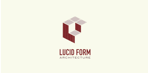
This logo is for a completely fictitious architecture studio called Lucid Form Architecture.
The icon is based on an optical illusion of a cube within a cube. Primarily, the form depicts a big cube, made of wood walls and metal-plated top surfaces, with a notch cut out of the center, resulting in a 3-D "L" shape. However, the longer one looks at this, perception begins to shift, resulting in a couple of different interpretations: 1) a small cube with a wooden wall and metal-plated bottom, in the corner of a room, hovering near the top of a tiled ceiling; 2) a room, tilted 90° clockwise, with hardwood floors, tiled walls, and a cube with a wood countertop and metal-plated side on the floor in the corner. This perception shift is important to the name, because it presents an ironic twist. To make "lucid" means to make clear, and while the icon seems to initially baffle and confuse, it ultimately encourages the viewer to challenge his or her preconceived notions of "perception." So too is the Lucid Form methodology for creating seeming impossible structures.

Brand: Advanced Scientific Matching..

Watch out for the killer gaming apps. Buy it on BrandStack.com
Ioannis Panagopoulos is a Software Engineeer.
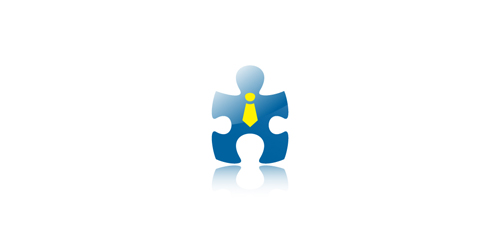
“The missing piece” of a puzzle was the concept for the symbol of this identity. As a result, a “human-lookalike” symbol was created based on a piece of puzzle, to show that without it, a project cannot be completed.

Purple rats - logo made of abstract, purple color, shapes. This logo can be used for any industry. The logo represents courage, precise, modern, aggressive, etc