Ocean logos (28)

Character logo created for Johnny Rotten's Aqua Adventures. A depot specializing in water sports and activities.


Logo for app development company. Naia means dolphin in hawaiian, but client wanted ocean symbolism (wave) in simple and modern way. Abstract, geometric wave shape. Overall look is minimalistic, modern and distinctive.

Simple, minimalistic and modern logo concept. Lettermark A and fish tail incorporated in subtle way make this concept - memorable, unique and clever.

TURTLE + DOUBLE HELIX For sale!
Logo process and branding: https://www.behance.net/gallery/31767063/Peaceful-Bay-Logo-Branding A wine company requested a logo that would represent Peaceful Bay a region located in a South -West Australia. Doing some research, I found out that whales visit the southern Ocean, a great symbol for the label and name. After multiple sketches this is the final result.
Logo for cruise travel agency in Prague.

Paddleboarding service logo

Badge design for a camping trip I organized with a few friends. Had some extra time at work, so I put this together for fun!

Salamander lizard floating on a leaf.

FISH

I made this while doing a personal project for a fake company called SquidSearch. It was for practice and to develop my skills in logo design. I also designed this squid so there was a hidden search icon. This logo is for sale.
whaley logo

Ready made logo design.
This logo is for a completely fictitious fish market.
The idea came to me when I discovered that it was possible to achieve a fish shape in the negative space within the bowl of the number 5. Dubbing my hypothetical company Pier 5 Fish Market, I created this illustrative mark in the hopes of really capturing the spirit of the nautical and maritime aesthetic. Type is custom for "Pier" and also the number 5, which is hand-rendered to look like it was painted on a wooden sign with a very wide, worn-out, thick-bristled brush. While it was important for the fish to show in negative space, it needed to look like a seemingly happenstance result of logical, real-world brush strokes. This is the minimal, alternate version of this logo.
Click here to see the case study for this logo, which chronicles its development, and includes full design rationale, sketches, electronic roughs, and alternate designs.
Australian dating website. Their tagline is 'Real People. Real Love'.

Logo of blog skippers.
This is a logo for sale A minimal and professional logo. It can works for many business like, design studios, video games, video game clans, surf, jet ski company, and many more. More info at http://graphicriver.net/item/hunter-logo/634852?ref=cooledition

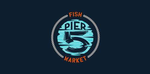
This logo is for a completely fictitious fish market.
The idea came to me when I discovered that it was possible to achieve a fish shape in the negative space within the bowl of the number 5. Dubbing my hypothetical company Pier 5 Fish Market, I created this very maximalist and illustrative mark in the hopes of really capturing the spirit of the nautical and maritime aesthetic. Type is custom for "Pier" and also the number 5, which is hand-rendered to look like it was painted on a wooden sign with a very wide, worn-out, thick-bristled brush. While it was important for the fish to show in negative space, it needed to look like a seemingly happenstance result of logical, real-world brush strokes. In the full lockup, the addition of the life preserver takes less emphasis off this gimmick, allowing one to slowly discover the fish.
Click here to see the case study for this logo, which chronicles its development, and includes full design rationale, sketches, electronic roughs, and alternate designs.