
Nature logos (145)

Unused logo proposal for Hart&Hound


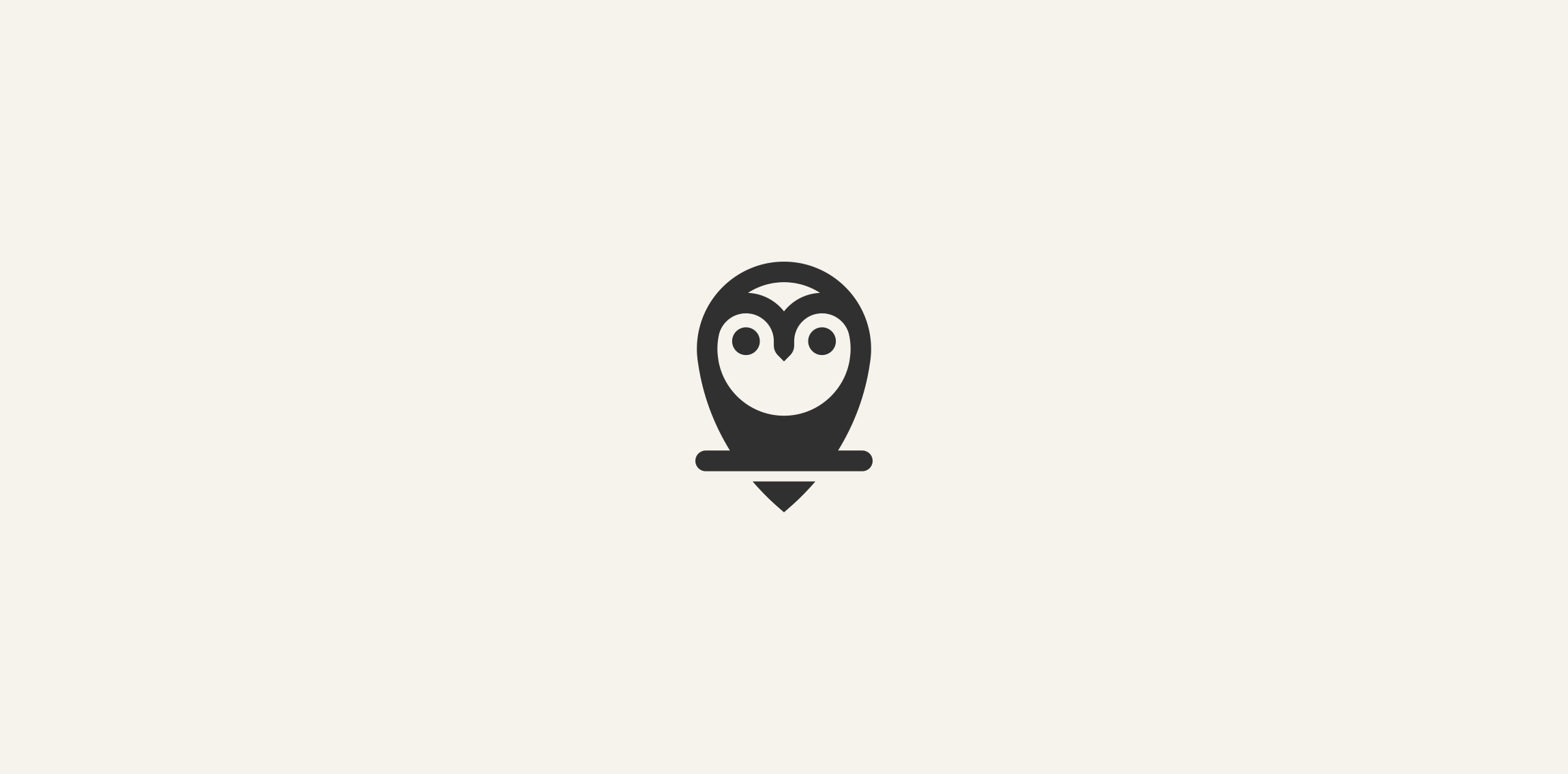
Owl logo just for fun. www.ashflint.com
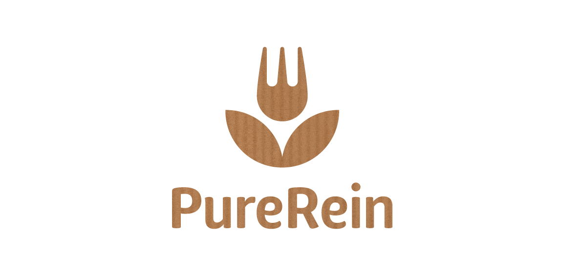
PureRein is a producer and distributor of healthy food Its founder, valuing the work of designers, like Polish logo design legend – Karol Śliwka – wished for a classically simple logomark. The created graphic combines symbols of a fork and a flower, representing food, nature and happiness. The fitting font is rounded, organic-like. Working with the Purerein brand consisted also of designing an extensive series of packaging with hand drawn illustrations of plants associated with the products.

A logo to promote the use of electric/clean vehicles.

For an online resource through which visitors can donate money to one or more writers (bloggers, journalists, fiction writers, poets, etc.) The mark has a pen shaped in the form of a tree. The water drop along with the gradual change of colors symbolizes the process of “feeding”/ or contributing
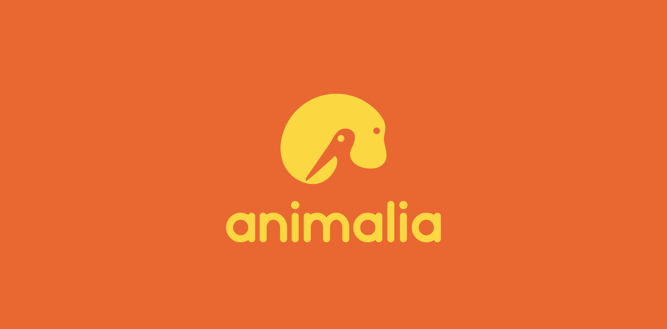
A logo depicting two animals: a mammal in the positive space of the design and a bird within the negative space of the logo.

New work is here! Branding and packaging design for a Swiss cosmetic line-up. Check full case study in my portfolio. www.dominikpacholczyk.com


Stony Creek nature school - school in nature for children
I made several cuts to look like a logo of nature. The idea was not as expected but did not think it was going to be so well done and went better than I thought.

EcoPet is a startup that focuses on your pet's funeral, giving you the opportunity to plant a tree where you want to bury your pet.
One of my old logos restyled https://www.logomoose.com/featured/waterfall-2/
Inspired by organic products.
Landscaping & Gardening
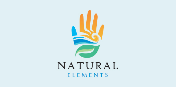
Natural and modern hand logo design with the hand created with the earth’s elements wind, water, land, sun and fire. The earth elements are beautifully incorporated into the hand design to create a seamless, distinctive logo design. https://www.logomood.com/downloads/natural-elements/
Bioengineering logo
Metamorphosis logo
Animation Logo - www.dribbble.com/shots/2334197-Love-Bird

Unique peacock dental logo design featuring a beautiful and elegant peacock bird. The peacock’s feathers are uniquely crafted to resemble stylized dental teeth that flow naturally to create the peacock’s body, frame and feathers. https://www.logomood.com/downloads/peacock-dental/

Another logo concept for Nahua cosmetic line. N monogram + leaf. www.dominikpacholczyk.com

logo energetic
Music Park logo