Modern logos (241)
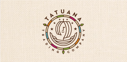
Tatuana Trading Company specializes in honoring tradition, culture, and nature of Guatemala by finding food treasures locally produced by small rural communities including chocolates, coffee alternatives, tea's, spices and other foods. The name comes from a famous legend in Guatemala: Tatuana was a beautiful woman that came to a small town and bewitched everyone. Spanish soldiers, declaring her a witch, put her in jail. When they were going to put her on trial, a soldier came to her jail cell and found it empty. She mysteriously disappeared, leaving behind only one thing: a drawing of a ship on the wall. It is said she climbed in the ship and sailed away. So lives on the legend of Tatuana...


Proposal for a construction company. Symbol is staircase in negative space and abstract "N" letterform.

Typographic exploration.

The Writer's Vantage manages a writer's day to day business tasks saving the writer time and allowing the writer to focus on writing.
Logo for web design company.
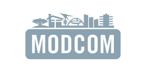
Los Angeles Conservancy's Modern Committee (Modcom) preserves modern architecture in Los Angeles
Proposal for New Sky Productions, a passionate, socially responsible company with a global reach based on powerful visual storytelling and compassion through journalism and use a range of multimedia elements to deliver the message.
Logo for my art & design studio.
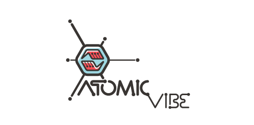
I define ATOMICvibe as the "a-HA!" moment of clarity in the creative process. Like nuclear fusion, it's when tiny ideas coalesce, and then explode into beautiful design.
The logo visually depicts this creative reaction. Forming abstract A & V shapes, the converging hands cradle the tiny beginnings of a big idea, fusing them until they discharge a shockwave of creativity. The custom type, designed to perfectly integrate with the mark, is meant to symbolize electron paths. Heavily inspired by retro imagery from the Atomic Age: science, the Space Race, Sputnik, the iconic George Nelson Ball Clock.
Click here to see the case study for this logo, which chronicles its development, and includes full design rationale, sketches, electronic roughs, and alternate designs.
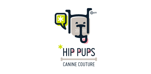
This fictitious company logo is the result of happenstance typographic exploration. I was playing around with H and I letterforms set in Platelet, and, after placing the I within the H, I noticed that it started to look like a dog face. After some modification, and with the addition of a curved P for an extended dog tongue, the resulting typographic illustration spelled "HIP." I thought it would be fun to name this fictitious company Hip Pups, which could be a shop that sells high-end dog accessories. The Registered symbol is integrated creatively into the mark by spelling "RUFF!"
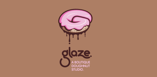
This is a totally fictional company that I refer to as "a boutique doughnut studio." I envision it as a trendy, metropolitan bakery that allows customers to glaze and decorate their own unique doughnuts. I wanted this to look really tactile, gooey, and sweet - like you really want to take a bite. Type for "glaze" is custom, and reflects the roundness of a doughnut. Click here to view my Flickr stream for full design rationale and additional images.
Fun, Clean Logo
Just a modern, clean logo.
Mobi Sock is a contemporary styled, rectangular shaped, fabric-knit "sock" with draw string (hence the whale's tail) to protect cell phones, ipods and other mobile electronic devices.

iPracticeMD is a nationwide medical billing and revenue cycle management firm in the US.
Terex Environmental Group is a hydrogeology consulting firm based in Calgary, Alberta, Canada providing environmental project management services to the energy sector.
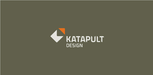
Katapult Design is a firm out of Australia who offers industrial and graphic design services. Concept: Client requested a very, very simple solution. The red corner piece appears as if it's being hurled away and the resulting two pieces are abstract K and D letterforms.
Travel bag and accessory distributor.