Logo logos (1957)

logo for a small architectural firm based in mexico.


logo for a hardware store based in mexico.

logo for a systems development firm based in mexico.

Tres Magos is Spanish for the Three Wise Men / Kings / Magi The name, referencing the distinguished foreigners who visited Jesus after his birth, bearing gifts, was meant to represent a producer of smart furniture for children, designed according to the Montessori education method. The logomark portrays both the Magi – as three coloured silhouettes or wizard hats, as well as Kings – in the form of a crown, which symbolises also the highest quality of products. The pleasent colours, rounded corners and use of basic shapes, signals the childrens theme.


CST is a training company. Symbolism of a chess knight is central to CSTs strategy. It exemplifies dynamism and initiative. Basing on these qualities and the target group in part the automotive branch I have referred in the lettering and composition to the aesthetics of sport cars emblems. Over the course of many sketches, I have created a convincing, minimalistic silhouette. Rendered as negative space against a chess square, it creates a bold, cohesive and legible mark.
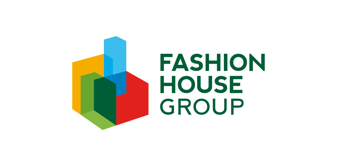
FASHION HOUSE Group is a developer and operator of fashion outlets from UK. A rebranding – the new logo was developed from a bold and surprising, albeit logical evolution of the old logomark. The abstract form of rising geometric solids invokes associations with both developer and operator activity of the Group. It references spatial dimension, development and growth. The colorful and multipart construction of the mark reflects the wide spectrum and multiple directions of FH Group’s activity. Graphic motifs derived from the mark’s structure form spectacular configurations to be used in layouts of publications and advertisements, while the colour palette allows building navigation with use of the colour code.

logo for a real estate company based in mexico.

logo for a safety shoes company based in mexico.

logo for a roselle flower and chia seed beverage.

logo for a dermatology clinic based in mexico.

logo for a small architectural firm based in mexico.

.

Like us on facebook: www.facebook.com/hunapstudio

How to cut leather

I created an icon of the Castle as simple and you can guess which is the Castle, the Portuguese can guess which is a Almourol castle, stays in Portugal, in the District of Santarém.

Wordmark crafted for developer of interactive solutions. • • • Follow us on www.instagram.com/triptic.pl

I made a simple merger in icon, joined the humming with plane wings
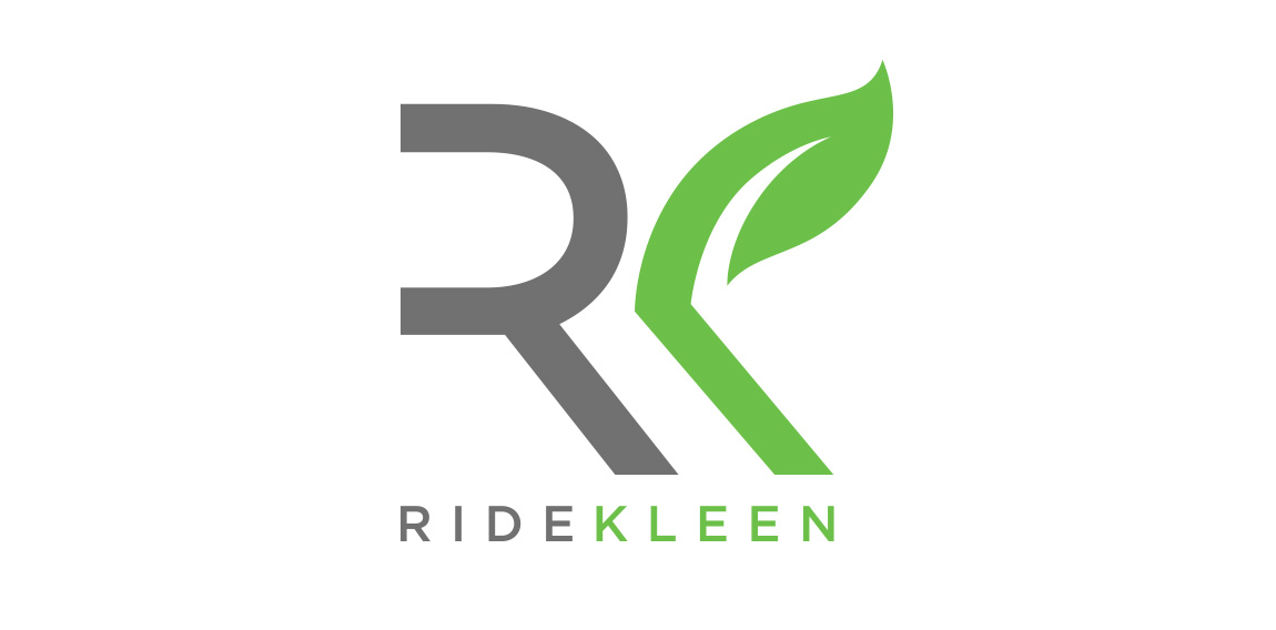
http://www.ridekleen.com/ In 2013, emerging from their stand alone waterless detail shop, two cousins came together to create Ride Kleen. Loving a clean ride but frustrated by the hassle and inconvenience of getting it washed they envisioned a day where your car could be pampered without you. KleenCare Technology brings that vision to life while helping preserve our earth’s most valuable resource through its waterless cleaning applications.

My personal logo. Please feel free to leave a critique here and there. ;)

New work is here! Branding and packaging design for a Swiss cosmetic line-up. Check full case study in my portfolio. www.dominikpacholczyk.com

Logo design done for a jewelry company
Rockstar

SE China Food App Design Author: Orlando Hora http://www.peopleperhour.com/freelancer/orlando/logo-design-x-branding-x-cad/1067789