
Life logos (49)

Ready made logo design.


Ready made logo design.

Ready made logo design.

Every muscle of the human form is made from Leafs that represent the Organic muscle's we were careful about the human muscle position.

Ready made logo.
Beauty salon
embryo
This logo is for a completely fictitious fish market.
The idea came to me when I discovered that it was possible to achieve a fish shape in the negative space within the bowl of the number 5. Dubbing my hypothetical company Pier 5 Fish Market, I created this illustrative mark in the hopes of really capturing the spirit of the nautical and maritime aesthetic. Type is custom for "Pier" and also the number 5, which is hand-rendered to look like it was painted on a wooden sign with a very wide, worn-out, thick-bristled brush. While it was important for the fish to show in negative space, it needed to look like a seemingly happenstance result of logical, real-world brush strokes. This is the minimal, alternate version of this logo.
Click here to see the case study for this logo, which chronicles its development, and includes full design rationale, sketches, electronic roughs, and alternate designs.

A company that specializes in providing environmental solutions of modern technology, which provides training and consulting on oil products, water and land pollution, as well as develop and manage projects using environmental regulations, in addition to the marketing of green products. Also made many contributions in raising the environmental awareness of the community through their efforts in the Technical Administration of the importance of recycling.

Dragonfly, lotus flower and person in yoga position integrated in one symbol. Made for a yoga teacher who wants to expand the brand to clothes and accessories.
environmental advice and projects

WildLife is a high end taxidermy studio specializing in African game provideing design and install Natural History Museum type exhibits.

Logo for a personal blog about life and all its positive quirkiness.
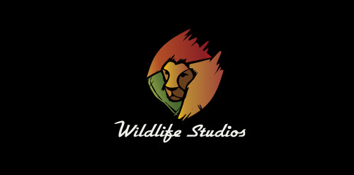
Wildlife Studios

Need help with organizing your life? Your office? They specialize in getting you "put together!"

exploring keeps us alive

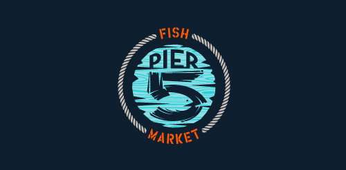
This logo is for a completely fictitious fish market.
The idea came to me when I discovered that it was possible to achieve a fish shape in the negative space within the bowl of the number 5. Dubbing my hypothetical company Pier 5 Fish Market, I created this very maximalist and illustrative mark in the hopes of really capturing the spirit of the nautical and maritime aesthetic. Type is custom for "Pier" and also the number 5, which is hand-rendered to look like it was painted on a wooden sign with a very wide, worn-out, thick-bristled brush. While it was important for the fish to show in negative space, it needed to look like a seemingly happenstance result of logical, real-world brush strokes. In the full lockup, the addition of the life preserver takes less emphasis off this gimmick, allowing one to slowly discover the fish.
Click here to see the case study for this logo, which chronicles its development, and includes full design rationale, sketches, electronic roughs, and alternate designs.

The good life! .. logo inspired by the beautiful Roman life of the '50s and '60s as the famous Fellini film. To make the logo a lot of fun and interesting I put a dog on the famous Vespa, a symbol of those years. The logo sums up the light-heartedness and joy, with a very humorous tone, in those years logo suitable for all business-like look and inspire joy in their brand

A mark is a combination of a seahorse, letter O. Some people also see a man's face on a backside of the seahorse.