Lettering logos (156)

Some experiment about verbicon, i hope you like :)


Some experiment about verbicon, i hope you like :)

some experiment about verbicon, i hope you like :)

Some experiment about verbicon, i hope you like :)

Some experiment about verbicon, i hope you like :)

Some experiment about verbicon, i hope you like :)

Some experiment about verbicon. I hope you like :)

some experiment about verbicon, i hope you like :)
Some experiment about verbicon. I hope you like :)
Some experiment about verbicon, i hope you like :)

Personal project for a luxury bank, i hope you like :)

mask
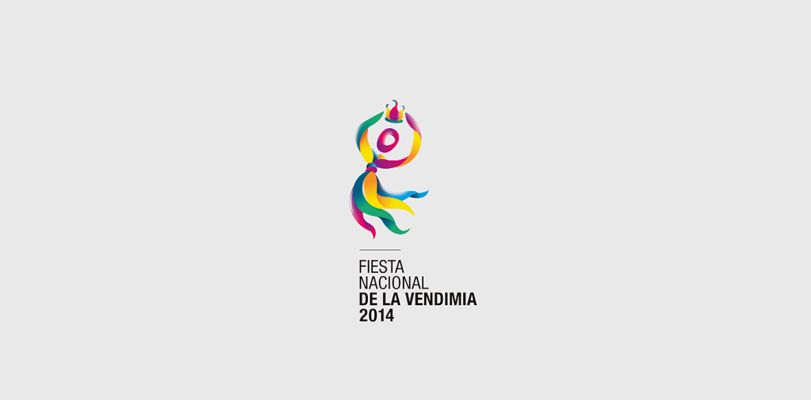
https://www.behance.net/portfolio/editor?project_id=14878035 Vendima es una festividad tradicional, refleja la celebración de la uva transformada en vino, tanto que los viñateros y las personas encargadas de las bodegas o los trabajadores pasan por diferentes factores de economía, políticos, socio-económicos. Ellos contribuyen al proceso de fabricación del mismo.
https://www.behance.net/gallery/20137993/High-style-collection

https://www.behance.net/gallery/34442955/Spiritual-Wisdom-Americas «Spiritual Wisdom Americas nace en la Montaña Sagrada del Ausangate, Perú, en Julio 2011, en un viaje de búsqueda de visión, donde en cada paso hay un diálogo directo con la Sabiduría de la montaña y sus Guardianes»

https://www.behance.net/gallery/14689073/GIS - www.gisobrasyservicios.com Empresa de servicios y obras apuntando a la industria mediana, en donde la competencia son pequeñas empresas familiares o trabajadores unipersonales (soldador, electricista etc). Los cuales si bien conocen muy bien el trabajo a realizar, no se adecuan a las necesidades actuales de los clientes, en cuanto a documentación, manejo de planos de ingeniería, informes, presupuestos y certificaciones.

Nugno is a company that was formed when two compatible and creative individuals – Luca & El – came together. Grafting in collaboration, the pair multiply the excellence of their work, producing result- and experience-driven work. Their mission was to design an identity to define a distinct brand style that communicated the core values at the heart of the business – passion and creative brilliance. The final design combined a minimal typographic aesthetic and simple colour palette to create a distinctive visual identity communicating the purity of their style.
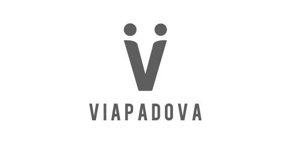
Once upon a time, the area known as Via Padova in Milan, Italy, had a less than salubrious reputation. Our project was to help change that image by creating a new identity for the area that would bring the various groups of people – or local tribes as we called them – together. We needed to represent Via Padova as a space that welcomed every one of its citizens – a challenging proposition. The city needed a visual system, a graphic identity that could organise and simplify communication with the people. We used the letter V to symbolise a handshake – and hence the union and coming together – of two people, symbolising a community coming together.
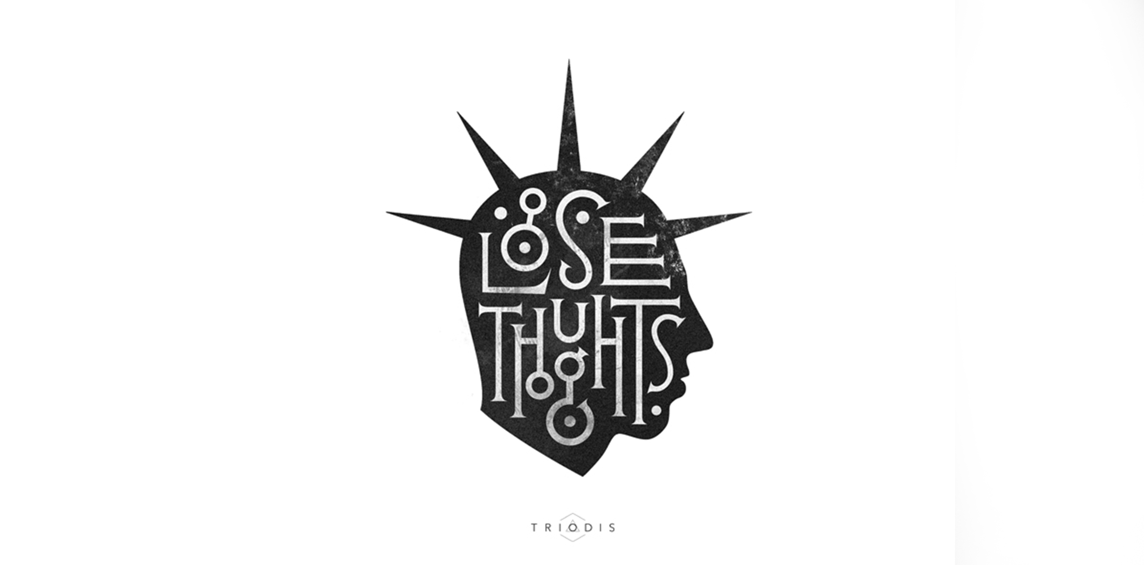
Typo illustration which i have been made in free time.

Coffeehouse chain.
Logo for a new apparel company named Outlaw
Just playing around the naming and custom letters. Follow us on www.instagram.com/triptic.pl

Wordmark for new modern building in Bratislava/Slovakia.