Jan Zabransky logos (18)
MG logo is unused proposal and is available for purchase. Contact me for further details.


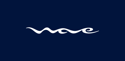
I designed logo Wave for client that is opening fast food restaurant in Sankt Petersburg, Russia. Target consumer of the restaurant are young active people, who found excitement in extreme sports, mainly water sports such as surfing or wake boarding. Client provides me with own sketches of the logo at the beginning of the project. Simple pencil sketches with name of the restaurant stylized into shape of wave was source of inspiration through whole process of logo design.
PROJECT Panax Pharma is Czech based distributor of medicines and pharmaceuticals. I was asked to create simple and distinctive visual identity including logo manual and stationery. CONCEPT The logo contains stylized illustration of medicine mortar - traditional tool used for pharmaceuticals production and processing. The mark is reflecting susceptible and responsive approach of company through subtle rounded stylization and refined execution of it's design. Negative space used in illustration of the mortar also inspires emotions of preservation and processing content from out. Finally Optima typeface with turquoise and silver color palette completes company corporate identity design basics.
Logo for France based company that specializes in designing new ZOO parks and services related to wildlife animals housing.
Logo design for a company creating rich media websites and microsites.
Logo design for photographer.

Logo design for professional wedding photography company capturing creative wedding photos.


Coffee Cup logo