Illustrative logos (17)

Scottish themed online Whisky Store.


Self-branding logo featuring a wolf.

Logo/label for Black Twig farms. The farm is in TN and the most popular apple in TN is named Black Twig and make a cider from them. This variety of apple has a strong history in TN as it was widely known as Andrew Jackson's favorite apple, so president Jackson is portrayed on the logo/label.

Symbol for Cafe Fika company in negative. FIKA is a Swedish concept of gathering together on the evenings with friends, family, colleagues, having a pleasant and cozy time around coffee. Symbol is inspired with an Swedish story, with boy and bear, who gives a coffee beans to bear and makes friendship.

Strongpack is a company that sells supplements for female population. Client wanted a similar pose and inspiration for the logo was "We can do it" poster.

Logo for food truck company, located in Brasil.

Personal logo designed back in 2012. You can notice the shape of the dragon makes initial "b" of boat.

A logo design for companies dealing with illustrative signs, billboards, banners etc. The design is also excellent for automotive services like towing company and auto shops.

Customizable Ready Made Logo Design http://eisaks.wordpress.com/2014/04/07/birdspce/
This logo is for a completely fictitious fish market.
The idea came to me when I discovered that it was possible to achieve a fish shape in the negative space within the bowl of the number 5. Dubbing my hypothetical company Pier 5 Fish Market, I created this illustrative mark in the hopes of really capturing the spirit of the nautical and maritime aesthetic. Type is custom for "Pier" and also the number 5, which is hand-rendered to look like it was painted on a wooden sign with a very wide, worn-out, thick-bristled brush. While it was important for the fish to show in negative space, it needed to look like a seemingly happenstance result of logical, real-world brush strokes. This is the minimal, alternate version of this logo.
Click here to see the case study for this logo, which chronicles its development, and includes full design rationale, sketches, electronic roughs, and alternate designs.

Bullen Tea is a specialty tea retailer with a social conscience. We bring to our customers first grade teas that are certified organic and fairly traded. Before tea makes its way to the hands of customers, like most products, it will go through a supply chain: tea pickers, traders, auctioneers, factory workers and blenders are involved in this process. Tea pickers, being the ones further removed from the customers in the supply chain, are usually victims to poor working conditions, very low wages and little to no government support. Our goal as a social business is to solve these problems by creating awareness; setting high standards and ensuring our business partners have proper working conditions and wages to all of their workers; and being ambassadors to local communities.

New York Fish logo, was designed for any company, dealing with fish selling, or any other kind of fish food. You can see the "crown" of statue of Liberty city in NY, and illustrated fish - New York Fish.

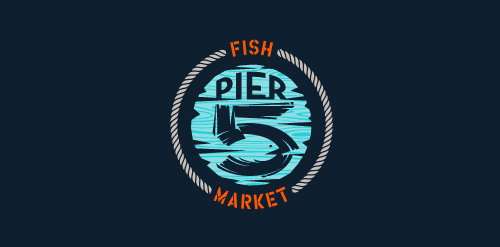
This logo is for a completely fictitious fish market.
The idea came to me when I discovered that it was possible to achieve a fish shape in the negative space within the bowl of the number 5. Dubbing my hypothetical company Pier 5 Fish Market, I created this very maximalist and illustrative mark in the hopes of really capturing the spirit of the nautical and maritime aesthetic. Type is custom for "Pier" and also the number 5, which is hand-rendered to look like it was painted on a wooden sign with a very wide, worn-out, thick-bristled brush. While it was important for the fish to show in negative space, it needed to look like a seemingly happenstance result of logical, real-world brush strokes. In the full lockup, the addition of the life preserver takes less emphasis off this gimmick, allowing one to slowly discover the fish.
Click here to see the case study for this logo, which chronicles its development, and includes full design rationale, sketches, electronic roughs, and alternate designs.

Fun logo for a developer's blog.
Logo created for a Berries production company