Illustration logos (103)
Fictional logo for an Adidas-themed résumé. This is in no way affiliated with Adidas.
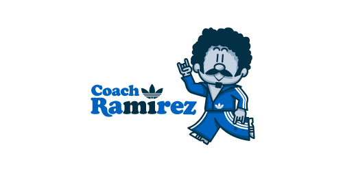
Earlier this year, Adidas Originals had an open Design Director position in their Portland HQ, and, being a lover of the brand, I decided to apply. To demonstrate not only my skills as a graphic designer, but also my knowledge and respect for the adidas brand and its legacy, I designed a self-promo booklet (a highly-conceptual adaptation of my current résumé) that is aesthetically inspired by adidas Originals marketing brochures. The booklet chronicles the accomplishments of a fictional alter-ego, Coach Ramirez — an adidas track suit wearing, afro'd, mustachioed designer — and is written as if he's actually the Design Director at adidas Originals. Sadly, I didn't get the job.
Click here to view my Flickr stream for full design rationale and additional images.


Self logo and identity of my face.
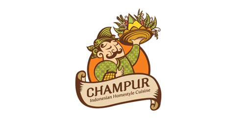
Logo for an Indonesian cuisine restaurant.

Logo for a local book fair.
Custom type created from some font options I'm exploring.
Thats a Logo i did for a CoffeeShop which is specialized to Good Coffee, Limited Editions Sneaker and Artworks.

Logo for a personal blog about life and all its positive quirkiness.
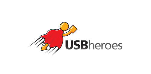
Here is USB superhero!
This is just my idea which came into life at last.
Logo is perfect for any kind of business related to USB devices,flash drives etc.
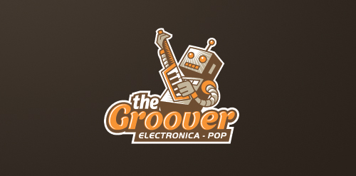
Logo for an iOS music app specializing in electronica-pop genre.

Logo for a content website for online freelance writers.

Bear quotes

This logo is for a completely fictitious fish market.
The idea came to me when I discovered that it was possible to achieve a fish shape in the negative space within the bowl of the number 5. Dubbing my hypothetical company Pier 5 Fish Market, I created this very maximalist and illustrative mark in the hopes of really capturing the spirit of the nautical and maritime aesthetic. Type is custom for "Pier" and also the number 5, which is hand-rendered to look like it was painted on a wooden sign with a very wide, worn-out, thick-bristled brush. While it was important for the fish to show in negative space, it needed to look like a seemingly happenstance result of logical, real-world brush strokes. In the full lockup, the addition of the life preserver takes less emphasis off this gimmick, allowing one to slowly discover the fish.
Click here to see the case study for this logo, which chronicles its development, and includes full design rationale, sketches, electronic roughs, and alternate designs.
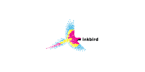
A bird made up of the colors cyan, magenta, yellow, and black to represent a printing company.
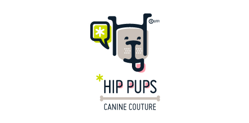
This fictitious company logo is the result of happenstance typographic exploration. I was playing around with H and I letterforms set in Platelet, and, after placing the I within the H, I noticed that it started to look like a dog face. After some modification, and with the addition of a curved P for an extended dog tongue, the resulting typographic illustration spelled "HIP." I thought it would be fun to name this fictitious company Hip Pups, which could be a shop that sells high-end dog accessories. The Registered symbol is integrated creatively into the mark by spelling "RUFF!"
Illustration T-shirt contest for the UN World to end violence against women