Identity logos (237)
Law Firm in Boise


New identity for Momentum Media, a small video production company in Seattle.
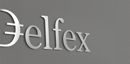
Logo and corporate identity for company trading with foreign currency. I was working on this project last two month. I made for client whole identity set from logo design, stationery design, web design with programming part, copy-writing including slogan and finally design manual. Logo on this photo is mounted in headquarters office on a wall. It was carved out of brushed aluminum plate to gain metallic look which is symbolic interpretation of currency, money and prosperity. Metallic effect literally connects whole identity. All stationery is printed by PANTONE 811 C metallic silver color. For selected materials such as business cards, compliment cards, envelopes and documents folder was used special silver metallic paper.
Identity for upcoming hair extensions brand from New Jersey, United States. Lure Hair sells 100% indian human hair extensions to women and salons.

Identity for a Northford, US based B2B/B2C writing and editing agency that serves large multinational and global firms, businesses of all sizes, nonprofit organizations, and entrepreneurs.
This logo communicates a fun, playful message while presenting the “g” that makes Geoff’s name unique. The splat was created by throwing paint soaked objects at board, and scanned in to get the perfect splat. The “g” is created from the negative space to provide an aesthetically interesting symbol, while allowing this mark to be produced in a wide variety of printing and post-printing methods.
This logo was created as a personal brand mark for Geoff, to represent him as a graphic artist. This typographical solution was inspired by the 17th century Romaine du Roi, which features a serif face with its underlying structure. This mark was used previous to the Geoff Matheson Studio "G splat" and is no longer in use.
This logo was created for a collaborative social network project, Organism. The icon represents people networking together to create a larger network, and these networks working together - communicated through the graphic of gears made up of abstract people. Visit www.groworganism.com to learn more.
This logo successfully represents this land developing and civil engineering firm as a contemporary business with their eye on the future. The mark is inspired by a standard target tool used in their industries. Because the majority of W+A’s clients are from within these industries, this provides an excellent communication. The negative space from within the typography creates the “+” in the name, but also serves as a crosshair, as seen in the tools of their trade.
This logo was created as part of a rebranding project for ITMS. ITMS is a high-end lawn and plant care company that uses only 100% natural, organic products. With this new logo, they have a more reputable, professional appearance, as this design has helped them compete on a higher level. This design was inspired by the new ITMS tagline, "green plants, blue water" which is a symbolic, cause-and-effect statement. From this we created an iconic brand identity, that is optimistic and bright, appeals to the target demographic and is extremely versatile.
YouBoom logo for internet radio, streaming. Client insisted for a speaker.
Logo for Bella Florist.