Icon logos (226)


timequest logo
timequest logo
Appique logo and icon design
logo for a talent coach, wanted a bold design that created a sense or urgency
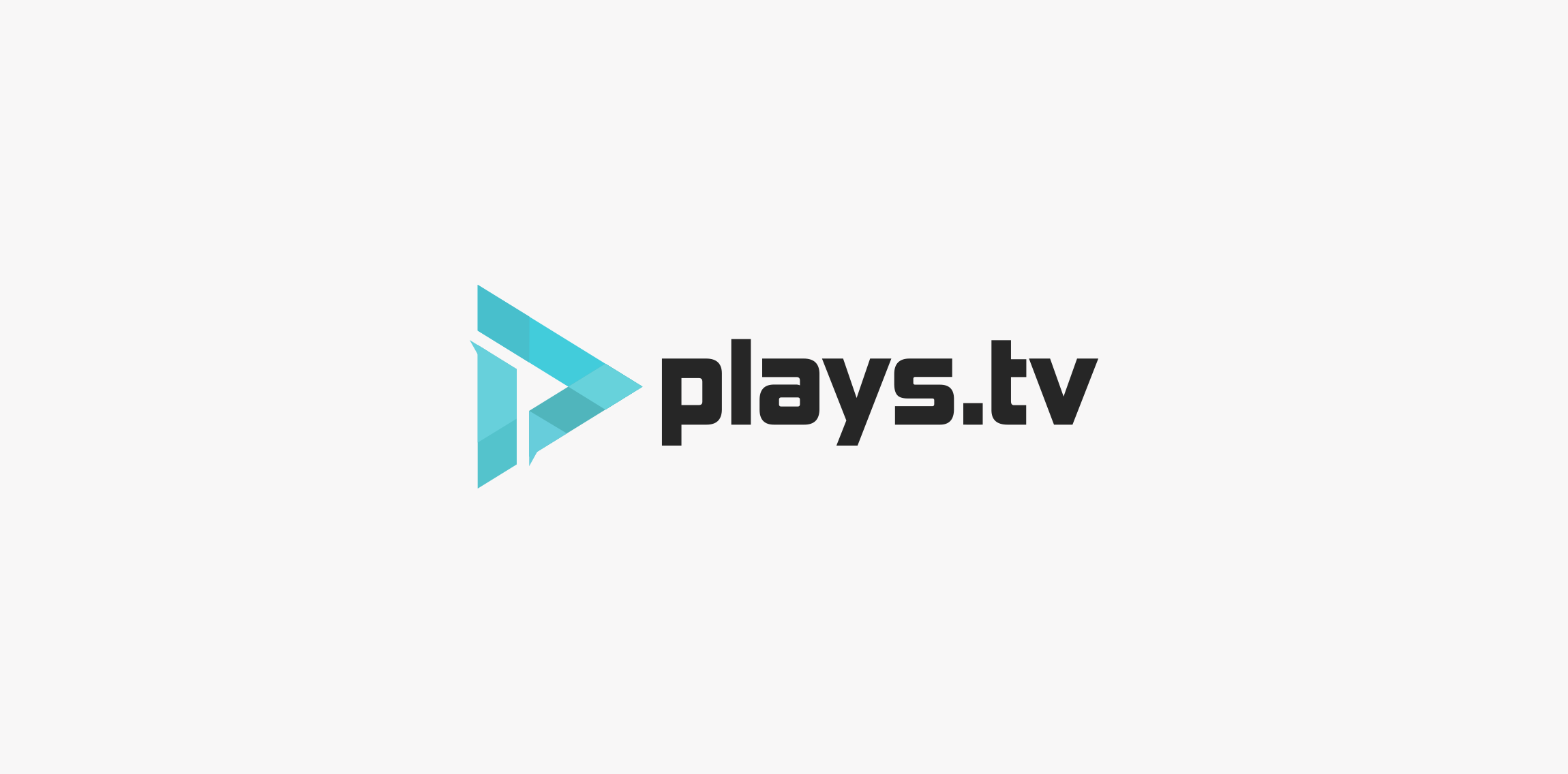
Here is a logo redesign concept for plays.tv. I tried to create something simple, modern but also keeping a bit of that gaming-ish style because that's what plays.tv is all about. The logo also shows the letter P inside the logo using negative space. Thank you for reading, if you liked how this project turned out be sure to leave a like! Ciao.
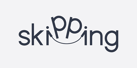
Skipping verbicon
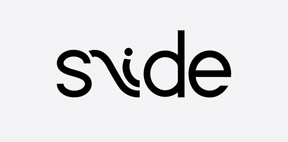
Slide verbicon
Logotipo para centro de estética Dourados MS
Logotipo para loja de roupas infantis
Science and Business Centre ''Żak''. The largest network of post-secondary school in Poland. / www.zak.edu.pl

Sweet Home

Brand BeardMade SP, Brasil.
Creative Bird Social Media Campo Grande, Brazil

Brand Amy Maia Alta Costura Patos de Minas, Brazil
Logo for company of the agricultural sector. New Andradina, Brazil.

Brand design for accounting advice. 2017, Três Lagoas, Brazil Brand concept: The challenge was to work the figure of Lobo, which is the name of the company; In a more minimalistic way and with surrounded forms; The construction of the brand was done through circular grids to make the project more harmonized.

Brand Team League of legends
I'm on the HIGHWAY TO HELL!!!
This logo is shaped as a letter G and is suitable for any freelancer, business or service that is modern and wants to stand out. The icon is very recognizable and unique. If you want to buy this logo, it is for sale at SuitableLogos.com