Germany logos (17)
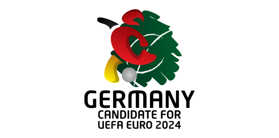
A logo for Euro 2024 - Germany


This logo was developed for Heim by VisualCast Designology. Heim is the authorised international distributor of Leicht Kuchen and Rolf Benz, which are Germany high-end home furnishings brand. Heim’s retail stores is located in Surabaya and Jakarta, Indonesia. The logo is comprised of clean, simple and modern custom-made lowercase typeface. The feel from the logo is personal and luxurious. More information available at http://www.visual-cast.com.
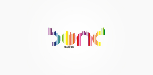
Electronic music records label from Germany.

For Neuerlehrer (New Tutor) an education provider. This concept deals with the idea of well-balanced study. The mortarboard of course doubling as a see-saw. General vibe requested was light-hearted/friendly/playful, they wanted a logo the could double as a character/mascot to be used as a guide through the software, remember the paperclip helper from Microsoft Word? Similar/same premise. The represented 'age' of the owl is that of an owl chick, so that it can grow up along side the student.

muh!caffe | GERMANY | 2012

second concept for muh!caffe | GERMANY | 2012
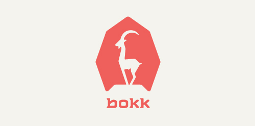
I recently realized I've never designed anything animal related. So I decided to give it a try with this ibex. The logotype was custom made and incorporates characteristics of the ibex. (The name bokk is derived from the word sprinbok.)

Logo for a company engaged in learning the German language.
Electronic music records label from Germany.