Fair logos (8)

BEAUTY


The symbol is inspired from the huge outdoor tent that is so characteristic of a Mela* or Fair. It depicts a colourful tent made up of arrows converging which stands for the exhibitors and the consumers who come from different areas to meet under one roof. (Mela means Fair in Hindi)

Logo for a local book fair.

Designer: Denis Aristov Client: Government of the Republic of Dagestan Industry: Exhibition Keywords: Caspian, exhibition, exposition, international, expo, demonstration, showing, sail, sailer, sailing, ship, multicolored, polychrome, bright, transparency, gradient, impressive, emotional, fair, wind, fresh, breeze, before, the, wind, leadership, Caspian Sea, Republic of Dagestan
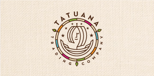
Tatuana Trading Company specializes in honoring tradition, culture, and nature of Guatemala by finding food treasures locally produced by small rural communities including chocolates, coffee alternatives, tea's, spices and other foods. The name comes from a famous legend in Guatemala: Tatuana was a beautiful woman that came to a small town and bewitched everyone. Spanish soldiers, declaring her a witch, put her in jail. When they were going to put her on trial, a soldier came to her jail cell and found it empty. She mysteriously disappeared, leaving behind only one thing: a drawing of a ship on the wall. It is said she climbed in the ship and sailed away. So lives on the legend of Tatuana...

FairPlay is a sports & cultural marketing agency. We chose to design a colorful identity, that could also change and evolve. The logo consists of a shield - evoking the prestige of major sports clubs, with a left side wearing stripes (meaning fair, straight, respectful) and a right side reprensenting the "play" side: curves, meaning creativity, fun, and competition.

Handmade Fair ;)