Experience logos (9)
Sayed Essam is a 16 years old Designer based in 10th of Ramadan City, worked on himself in the design field since the age of 10, started working on multiple graphic work since 12. Ambition is what keeps him moving, struggling to achieve his dream. Working on himself in manipulation, motion graphics, web design, branding, marketing and social media. Creativity, Quality, Self Learning, Improvement and Hard-Working been his habits forever.


Typographical clean TEO logo design inspired by TEDx

The vision through a human eye experiencing fun and colorful experiences. Logo design for a mobile app company, with a focus on creating augmented reality.

Indigenous Experience is a travel company that provides holidays were clients spend time with the local tribal people from that country.

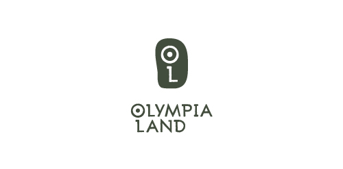
Olympia Land S.A. is a company that provides liveable experiences, cultural events and educational programs in Ancient Olympia, Greece. Services and programs include ancient Pentathlon reenactment, music festivals, trekking, mountain bike, rafting and more.. The inspiration of this logo was based on an old map of Ancient Olympia and the actual ruins of this holy venue.

"Synthesis Centre" is a centre of physical and spritual health, in Athens. The services provided are consulting, psychotherapy, stress management, astanga yoga and more..
The concept of this corporate identity in general, is a "ball" that represents one’s soul and/or body that "unrolls" after being taken care through therapy and yoga. As a result, the symbol of this logo represents the physical & spiritual "lift-up" of a human figure, "the ending point" and the "result" of this whole experience.
In order to express its unique character, The logo was created from one single, black-inked line to show a handwritten style.