Design logos (795)

Exclusive Customizable Logo at Eisaks Logo Design.


БMA | Design Union

About the logo Hello! I'm working on a project with some cool hardcore techies. They know all about coding and stuff. Uhm, we are currently between two logos for their company. And the other version has a low-poly kind of style, while this one has a more stroke approach. Im just wondering what you guys think of this? Seen something that looks like it, does it suck? Is it great? Im open for honest feedback, I truly believe that honest feedback is the way we hate each other more, but also make better logo's!
Exclusive Customizable Logo at Eisaks Logo Design

"Iguaçu is the second biggest distributor of optical product of the South of Brasil and they were searching for the repositioning of their brand. We worked with a new communication aiming at the values of the company, which is about commitment and responsability.”

Italian Music Band branding

"Casa do Salame is a family company that has worked for over 15 years with handmade production of sausages and several other farm products. For the development of this brand, we added a more traditional/manufactured feel to it so that the public can feel that the products are unique and handmade. We used color tones that remind of Italy (the origin of the products and the family), and to make the handmade aspect clear, we used golden hotstamping on the materials.”

Scissors,razors,motors.. :)

Exclusive Customizable Logo at Eisaks Logo Design

Exclusive Customizable Logo at Eisaks Logo Design.
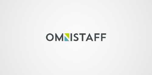
This was a commission we received from a company called Omnistaff - A recruitment Agency based in Johannesburg, South Africa. The company required a minimal logo that signified the multilateral approach they had to staffing solutions. This logo makes use of clever negative space to create the N, which just so happens to look like two arrows pointing in different directions.

Exclusive Customizable Logo at Eisaks Logo Design.

Exclusive Customizable Logo at Eisaks Logo Design

Exclusive Customizable Logo at Eisaks Logo Design
Exclusive Customizable Logo at Eisaks Logo Design.

Design for new business offering Cloud services.
Exclusive Customizable Logo at Eisaks Logo Design

"Our goal for a study of implementation of the new brand was to be based on the ideas and key objectives of the company are: Provide industrial assembly and maintenance services with quality and efficiency, which results in a competitive price and profitability. For the development of typography, seek work in the union of metal objects of everyday business, such as pipes, metal profiles and iron sheets, thus creating a unique and solid typography.”

"At Tesla, we don’t merely design or execute projects, but develop ideas and solutions that contribute to the well being of our planet. We think and act in a sustainable way. We entered the market selling products related to sustainability, due to this recent discovery made by the society.”

"The first mountain - the left one - is Mount Sajama, situated in Bolivia, the place of origin of the main ingredient of Bernino Gourmet Potato. The central mountain is Matterhorn, located in Switzerland, where the Rösti Potato was created along the canton of Bern. The White Rock is the last mountain and where Bernino Gourmet Potato will be launched, in Palhoça/SC, besides being a strong inspiration for the development of the first restaurant of this franchise.”

"We seek to refer the "S" in a caravel, indicating demand for the ideal property for each client.”

"Brand with typography designed for a law firm that works with realistic idea but to show the seriousness neoclassical added serifs to her.”