
Dark logos (21)

Scott Sanford is a fitness coach and instructor. With this logo a went with a modern but slightly gritty approach. He fell in love with this concept.


Cafe

Chop from KRUPS logo redesign proposal.

Logo for architectural company.
ONE dot logo.

little fox

Bear Logo I made for software development and consultancy company.
Can you read it?

Masqué [Fr.] - Means masked in English
BELLISO - logo and mark for beauty and fashion brand.
BELLISO = from Italian words bellissimo, bellissima
http://RadekBlaska.com
My personal mark, a combination of my initials - MN

There is one small story behind the meaning of TRIONN DESIGN LOGO Trionn Design is A Design Studio. 15+ years of professional experience in Website design. We are working on HTML5, CSS3, jQuery, UX, UI, RESPONSIVE DESIGN.

Design made for a company based in a small village called Urk in the Netherlands. They Buy and Sell salmon.
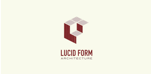
This logo is for a completely fictitious architecture studio called Lucid Form Architecture.
The icon is based on an optical illusion of a cube within a cube. Primarily, the form depicts a big cube, made of wood walls and metal-plated top surfaces, with a notch cut out of the center, resulting in a 3-D "L" shape. However, the longer one looks at this, perception begins to shift, resulting in a couple of different interpretations: 1) a small cube with a wooden wall and metal-plated bottom, in the corner of a room, hovering near the top of a tiled ceiling; 2) a room, tilted 90° clockwise, with hardwood floors, tiled walls, and a cube with a wood countertop and metal-plated side on the floor in the corner. This perception shift is important to the name, because it presents an ironic twist. To make "lucid" means to make clear, and while the icon seems to initially baffle and confuse, it ultimately encourages the viewer to challenge his or her preconceived notions of "perception." So too is the Lucid Form methodology for creating seeming impossible structures.
Logo for an URL shortening service. "Legível" means "legible" in portuguese.
associative play