Circle logos (97)
One of the logo concepts I did for music artist Taio Cruz.


logo for an IT company
For fun.

..

Personal logo for a photographer

This logo is for a completely fictitious fish market.
The idea came to me when I discovered that it was possible to achieve a fish shape in the negative space within the bowl of the number 5. Dubbing my hypothetical company Pier 5 Fish Market, I created this very maximalist and illustrative mark in the hopes of really capturing the spirit of the nautical and maritime aesthetic. Type is custom for "Pier" and also the number 5, which is hand-rendered to look like it was painted on a wooden sign with a very wide, worn-out, thick-bristled brush. While it was important for the fish to show in negative space, it needed to look like a seemingly happenstance result of logical, real-world brush strokes. In the full lockup, the addition of the life preserver takes less emphasis off this gimmick, allowing one to slowly discover the fish.
Click here to see the case study for this logo, which chronicles its development, and includes full design rationale, sketches, electronic roughs, and alternate designs.
Identity for a small design bureau in Ulm (Germany).
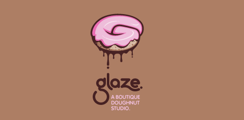
This is a totally fictional company that I refer to as "a boutique doughnut studio." I envision it as a trendy, metropolitan bakery that allows customers to glaze and decorate their own unique doughnuts. I wanted this to look really tactile, gooey, and sweet - like you really want to take a bite. Type for "glaze" is custom, and reflects the roundness of a doughnut. Click here to view my Flickr stream for full design rationale and additional images.
Logo Design for a high-end residential contractor based in Colorado.
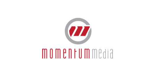
New identity for Momentum Media, a small video production company in Seattle.

Advertising agency
An unused proposal for an executive home staffing company which I turned into an high-end event planner agency. Combining pineapple, a symbol of hospitality, and fleur-de-lys, a symbol of elite.

Logo and label design for a Texas based ranch that grows and sells their own olive oil.
Logo design for Paez Production, 2011. ||| http://inkbotdesign.com/2011/02/paez-production/