Brown logos (75)


An icon for a bakery.


Website that sells personalized chairs for kids.


old bakery that was looking for a simple logo in an old style.

A profile of a lion with surrounding space forming an 'L'
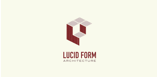
This logo is for a completely fictitious architecture studio called Lucid Form Architecture.
The icon is based on an optical illusion of a cube within a cube. Primarily, the form depicts a big cube, made of wood walls and metal-plated top surfaces, with a notch cut out of the center, resulting in a 3-D "L" shape. However, the longer one looks at this, perception begins to shift, resulting in a couple of different interpretations: 1) a small cube with a wooden wall and metal-plated bottom, in the corner of a room, hovering near the top of a tiled ceiling; 2) a room, tilted 90° clockwise, with hardwood floors, tiled walls, and a cube with a wood countertop and metal-plated side on the floor in the corner. This perception shift is important to the name, because it presents an ironic twist. To make "lucid" means to make clear, and while the icon seems to initially baffle and confuse, it ultimately encourages the viewer to challenge his or her preconceived notions of "perception." So too is the Lucid Form methodology for creating seeming impossible structures.

Well the idea is pretty clear.
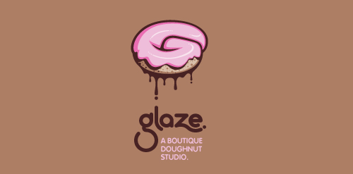
This is a totally fictional company that I refer to as "a boutique doughnut studio." I envision it as a trendy, metropolitan bakery that allows customers to glaze and decorate their own unique doughnuts. I wanted this to look really tactile, gooey, and sweet - like you really want to take a bite. Type for "glaze" is custom, and reflects the roundness of a doughnut. Click here to view my Flickr stream for full design rationale and additional images.
Logo for an URL shortening service. "Legível" means "legible" in portuguese.
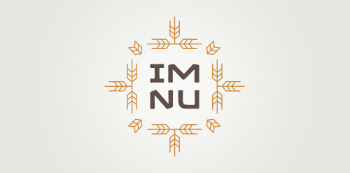
New logo concept for the barley & rye malt based drink »im nu«. See the process behind the custom type here: http://dl.dropbox.com/u/14259079/im_nu_process.png Big view including »Chocolate

'Higher Grounds' is coffee shop in Cloudcroft (New Mexico) situated 9000ft above the sea level with cool hills.. It's a kinda tourist spot.. So that's where this logo came from.. My idea is to show the place (Cloudcroft) with mountains and to take it over the coffee in a single line drawing.. And few colors added to make it more scenic by having the business on the core of the logo.. so it's kinda 50% for the business and 50% for the place..

My new personal logo. Full project on Behance: http://www.behance.net/gallery/Self-Logo/1470725

fun, country gal style.

Logo for a potential higher end housing development in a nice secluded wooded area. Many deer live in the area.

Tourism guide - know your edge Stylized footprint, the idea is that these curves represent the trip, during which we visit all the places in Lithuania(can be your country), and Lithuania(can be your country) shows instead a thumb. That would put a hidden message to the customer (tourist).
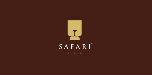
Logo concept for a bar. The mark is a combination of lion's head and a martini glass.