
Bird logos (163)

A logo design for arooster.com in which ive created an A shaped rooster. By Gregory Grigoriou


Brand identity for Copper Bird Cafe

little Bird logotype
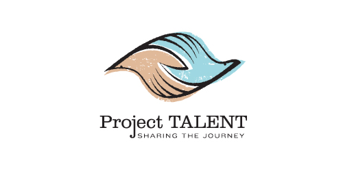
Unused proposal for an education-based initiative to reconnect with participants of a 50 year-old national survey of high school student aptitude in math, reasoning, and language. The current initiative aims to share these participants' stories from the past 50 years, and the collected data could be used in a variety of academic, economic, sociological, and health-related ways.
This mark is steeped in uplifting, motivational symbolism. It's constructed such that it could represent two hands clasped, two birds in flight, or even one hand cradling or releasing a bird. The hand-drawn line quality, typography, and offset color evoke a nostalgic '60s feel. Unused proposal.

For Neuerlehrer (New Tutor) an education provider. This concept deals with the idea of well-balanced study. The mortarboard of course doubling as a see-saw. General vibe requested was light-hearted/friendly/playful, they wanted a logo the could double as a character/mascot to be used as a guide through the software, remember the paperclip helper from Microsoft Word? Similar/same premise. The represented 'age' of the owl is that of an owl chick, so that it can grow up along side the student.

Two symbols, merged within one: an eagle and a wizard

Incubare is the latin word of incubation which means sitting on or brooding bird's eggs in order to hatch them and that's what is represented by the logo: a nest, eggs and a bird.Ideal for a maternity.

:)

:)

Happynest.kz _ online store

Logo for Lass company made by Logodesigner studio. In use by client.

Pet shop

Q-Bird

Logo for a church charity program, driving the local community to lend 'helping hands' for the less fortunate.

Shop postcards.
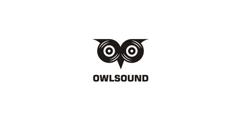
Owl made from two records.

Logo for forthcoming start up.

first concept made for Powiat Sredzki region in Poland - showing a eagle which is a part of a great treasure found in the 80s in this region - made for a competition.