viuze
 Joined March 2016
 9 logos
 http://viuze.com
Portfolio – Page 1
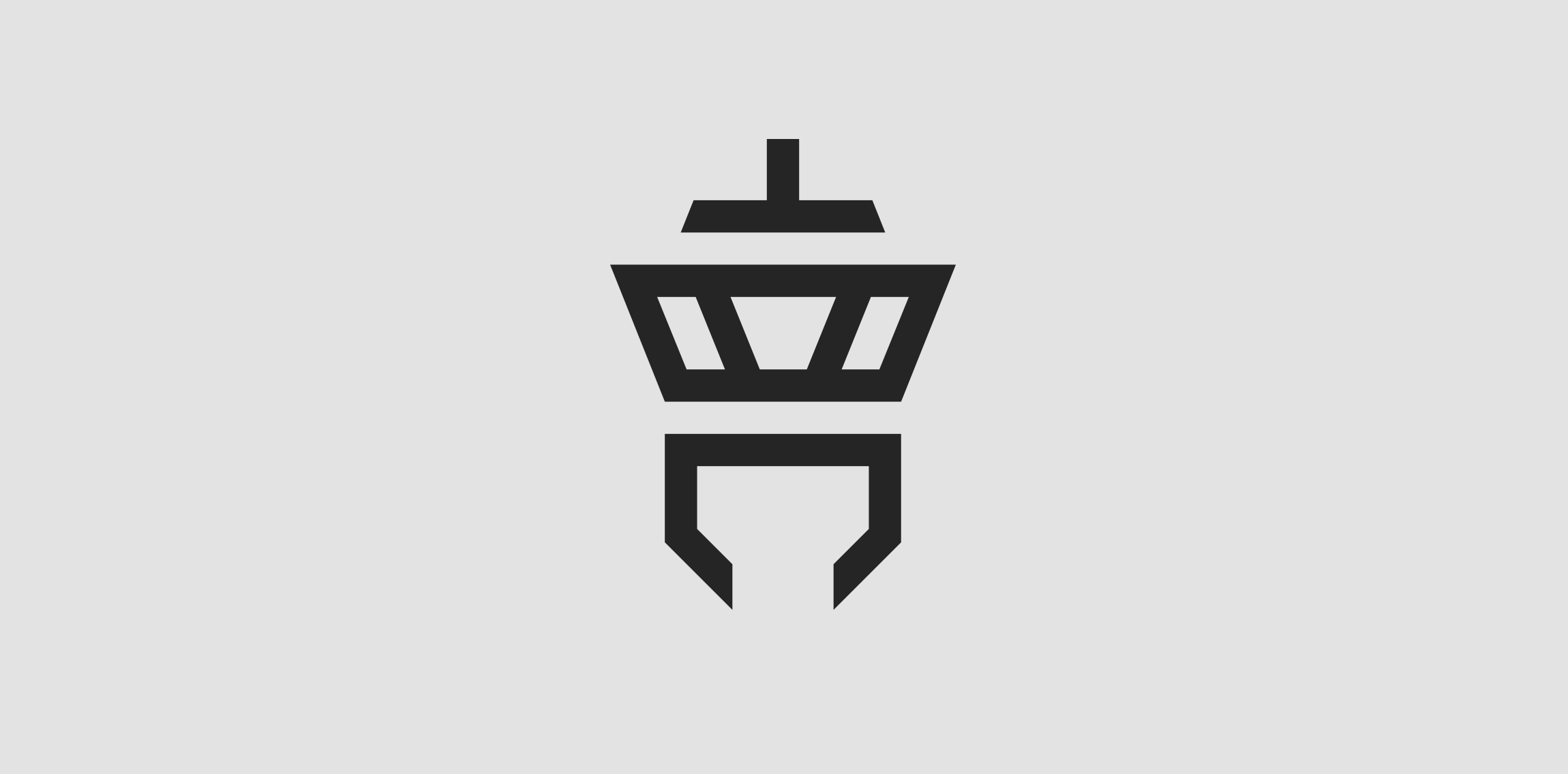
Client: Tower Communication The customer‘s wish was to have an abstract depiction of an airport tower in the logo. The antenna of the tower is an upside down T (for “Tower“) and the lower area is a downwardly open C (for “Communication“).
My personal logo. The name “viuze“ means “vivid colour light“ and is a composition of the english word “vivid“, the spanish word “luz“ (=light) and the german word “Farbe“ (=colour).

