


Captain logo
🔥 New Logo Concept for Sale! 🔥
Your brand deserves to be remembered — not overlooked.
Clean, bold, and built for versatility.
Perfect for brands ready to stand out.
👉 Follow @graphicspacex for more!
📩 info.graphicspacex@gmail.com
✅ Exclusive ownership (sold once)
✅ Fully editable & customizable
✅ Name & color changes available
✅ AI, EPS, PNG, PDF included
✅ 100% original vector design
Why settle for average when you can own a mark that makes a statement?
🚀 DM now to claim it or get your custom logo 📩
S letter logo
Modern “S” Lettermark Logo for Tech Brands
This sleek and futuristic logo design is crafted using the letter “S” with a strong tech-inspired aesthetic. Its clean lines and modern style make it an ideal fit for any technology company, startup, or digital innovation brand looking to establish a strong and memorable visual identity.
Interested in purchasing this logo?
📩 Contact me at hellorezapixels@gmail.com
I’m also available for new freelance projects — let’s build something incredible together!
Bathroom Remodeling
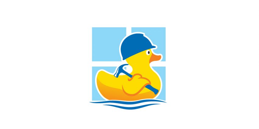
logo for a bathroom remodeling company with an iconic rubber duck character to portray the flexibility and friendliness of its workers
Abstract 3D “E” Logo Design
This bold and modern logo features a 3D-inspired abstract representation of the letter “E.” The geometric design and clean black shapes give it a dynamic and professional look, making it perfect for industries like technology, architecture, or branding firms.
This logo is available for sale with an exclusive license. Contact
FlowQi Logo Design
This minimalist geometric bird logo was designed for FlowQi.com, symbolizing freedom, flow, and precision. The bold black shapes and clean, modern lines create a striking and versatile design that aligns with the brand’s dynamic and elegant identity.
For inquiries about custom logo designs, contact hello@logofarmers.com.
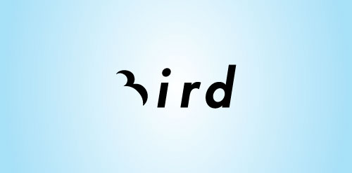
Geometric Bird logo design
Enter your text here…Introducing a Geometric Bird Logo Design – bold, minimalist, and versatile. Crafted with precision, this logo is perfect for brands seeking a strong and modern visual identity. Ideal for industries like aviation, technology, or any business striving for elegance and simplicity.
Hunter Capital logo

Combine a deer head silhouette with geometric lines to symbolize Hunter’s precision and expertise.
LEES Asia Limited

Instead of spelling out the full name, Locally Enabled Energy Solutions, the logo is made up from the four initial letters to aid recognition and ease of branding. They are specialists in environmentally-sustained power generation technology and supplies. Therefore the main colour is green. The upper portions of the “E”s and the “S”, however, are designed as a blue flame. In power generation terms this is crucial; it signifies the colour that is present when 100% of the available combustible fuel is being used, in other words: ZERO resource wastage/ TOTAL efficiency.
Plant Of Renown Church
Proud to unveil our logo, crafted with purpose. The Tree, Dove, Tulip, and Fire within it symbolize the essence of Jesus in our lives – Great Vine, Peace, Love, and Passion. It’s more than just a design; it’s a reflection of the values that guide us.
Fewitech logo Design
The logo creatively merges the letter ‘F’ with a WiFi symbol, symbolizing connectivity and forward-thinking technology. This modern design embodies innovation and digital communication, making it perfect for tech-focused brands.
Museum of Humanity Los Angeles (MOHLA)

MOHLA’s main goal is to ‘build a vision for a future filled with hope and promise’. But, what could create hope and promise?
In today’s world, in which many communities are forced to deal with dictators, issues like global warming threatens the next generations, and the greatest visionaries of our time are planning on building colonies on different planets, what can give us hope about the future of our world?
Our answer to that is ‘unity’.
No matter who we are, what we look like, or what we believe, when we come together, ‘hope’ arises. And when there is hope, we become one. The MOHLA emblem depicts that unity.
The new MOHLA logo also has additional, supporting meanings. In many cultures, ‘butterfly’ represents ‘hope’. Native Americans believe that the wish whispered to a butterfly will be granted when the butterfly flies up to the heavens.
Jurny

The Jurny experience begins at your home, and ends when you check out at your destination. Jurny covers everything in between, and gives you peace of mind. The Jurny logo conveys that ‘all-inclusive’ experience. Rounded custom typeface highlights the easiness to use and the approachable nature of the brand.